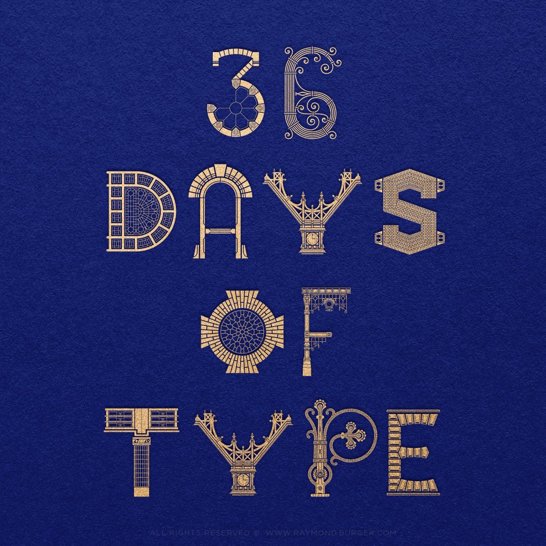
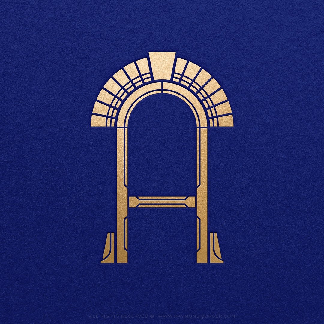
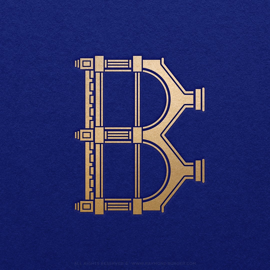
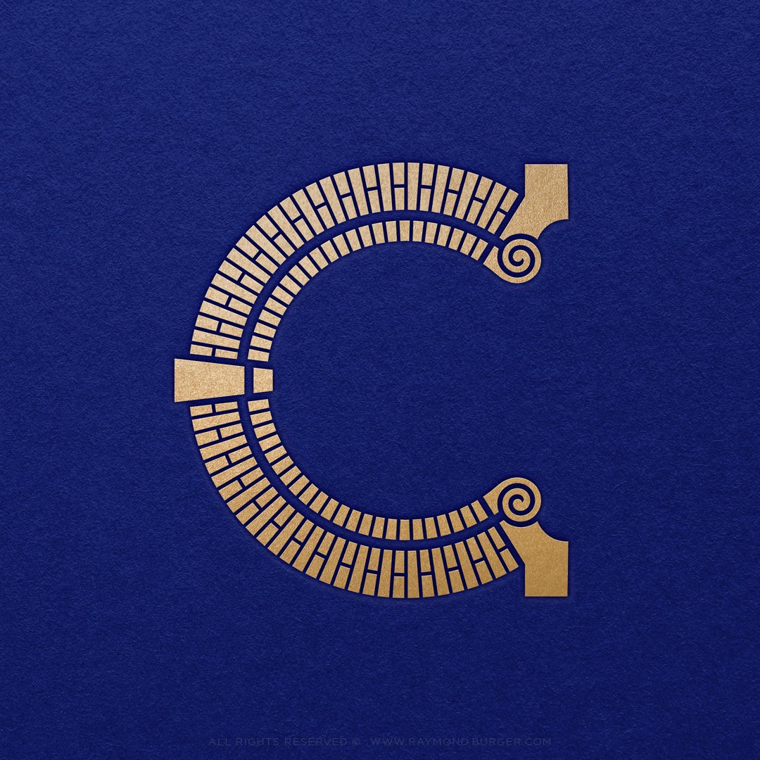
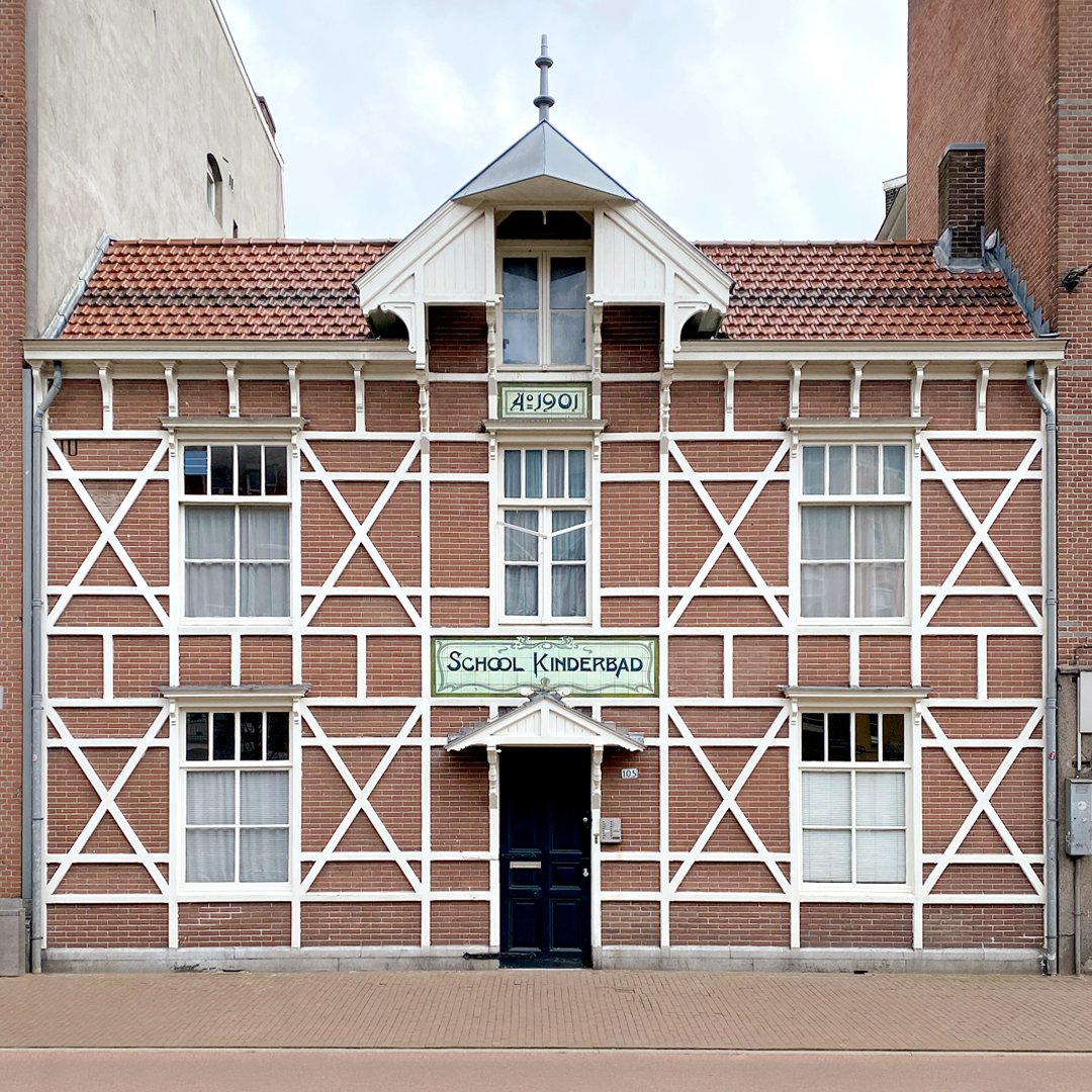
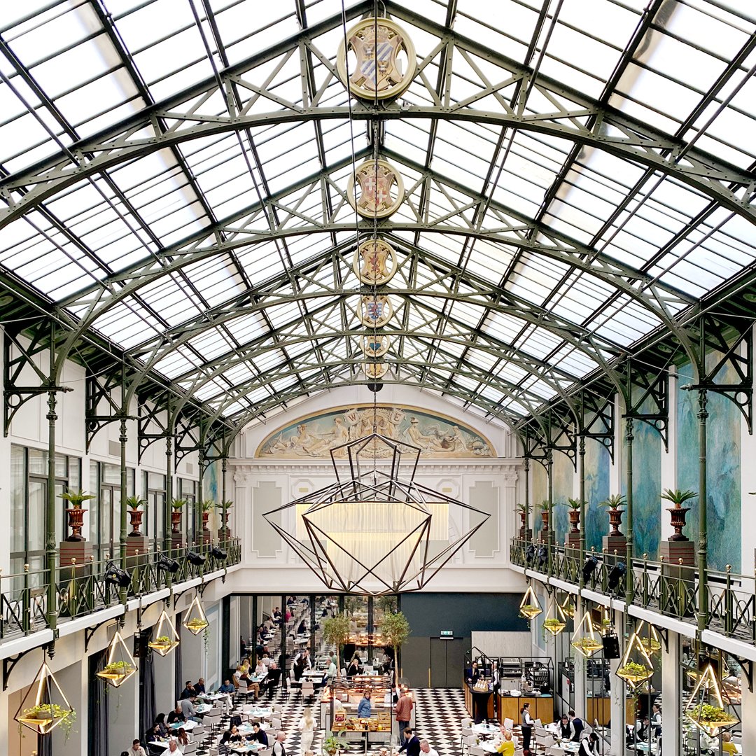
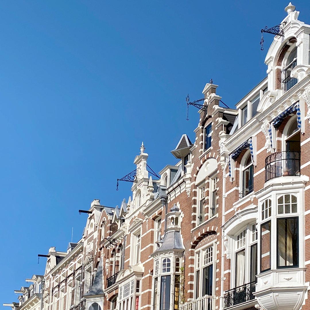
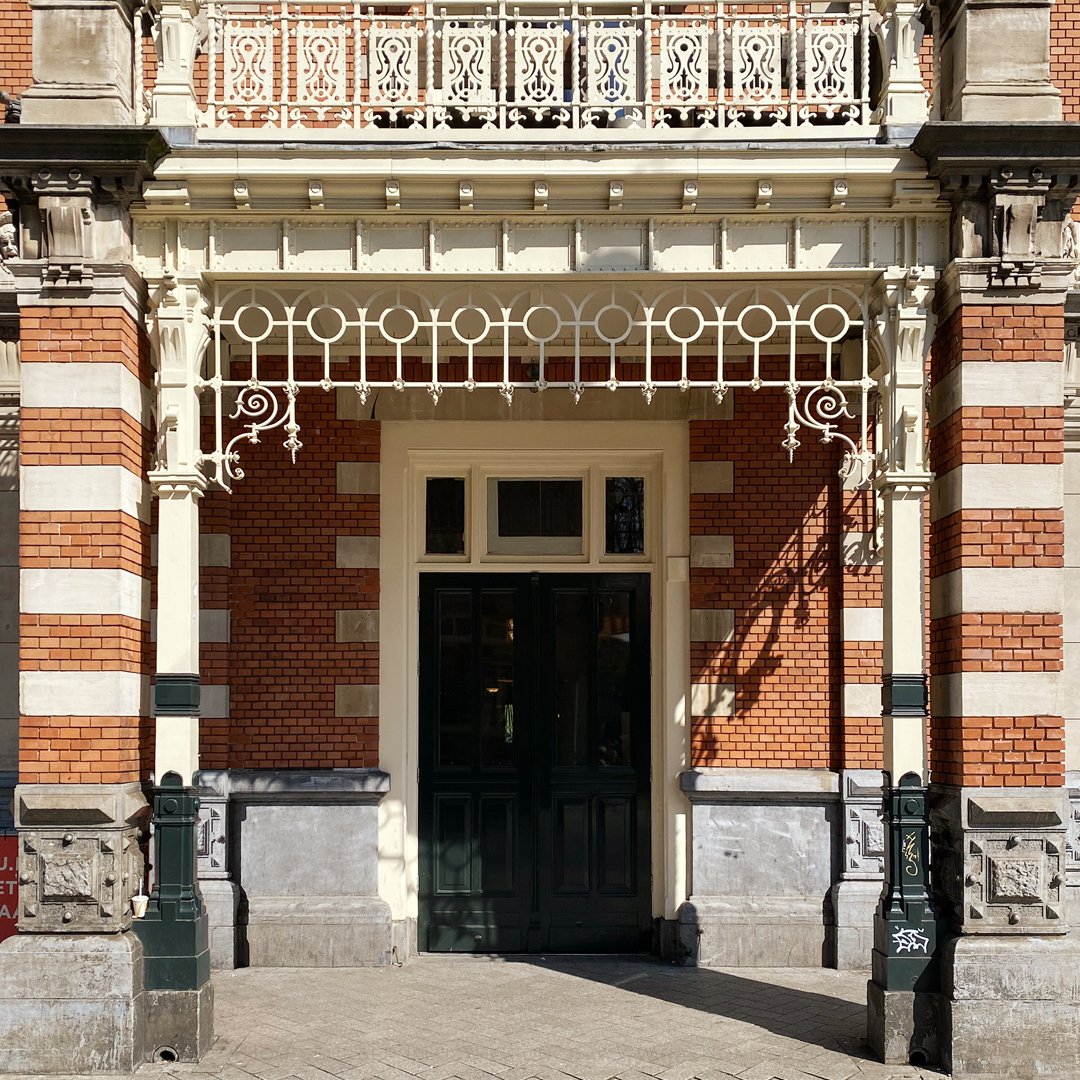
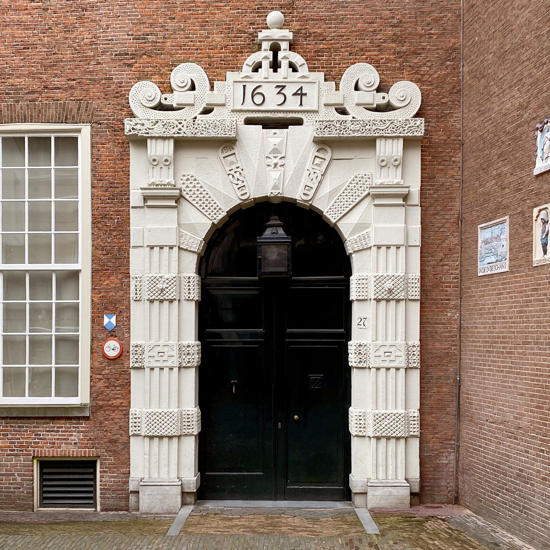
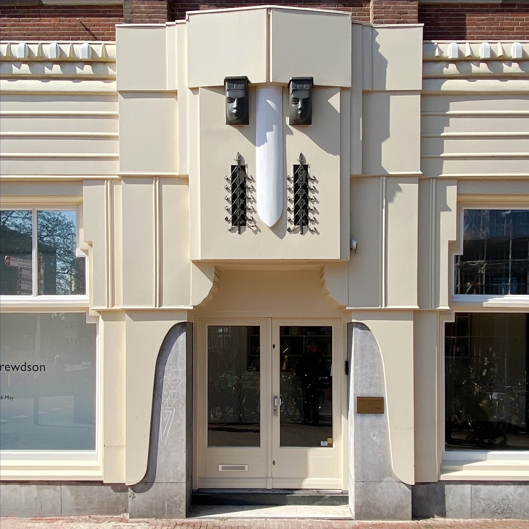
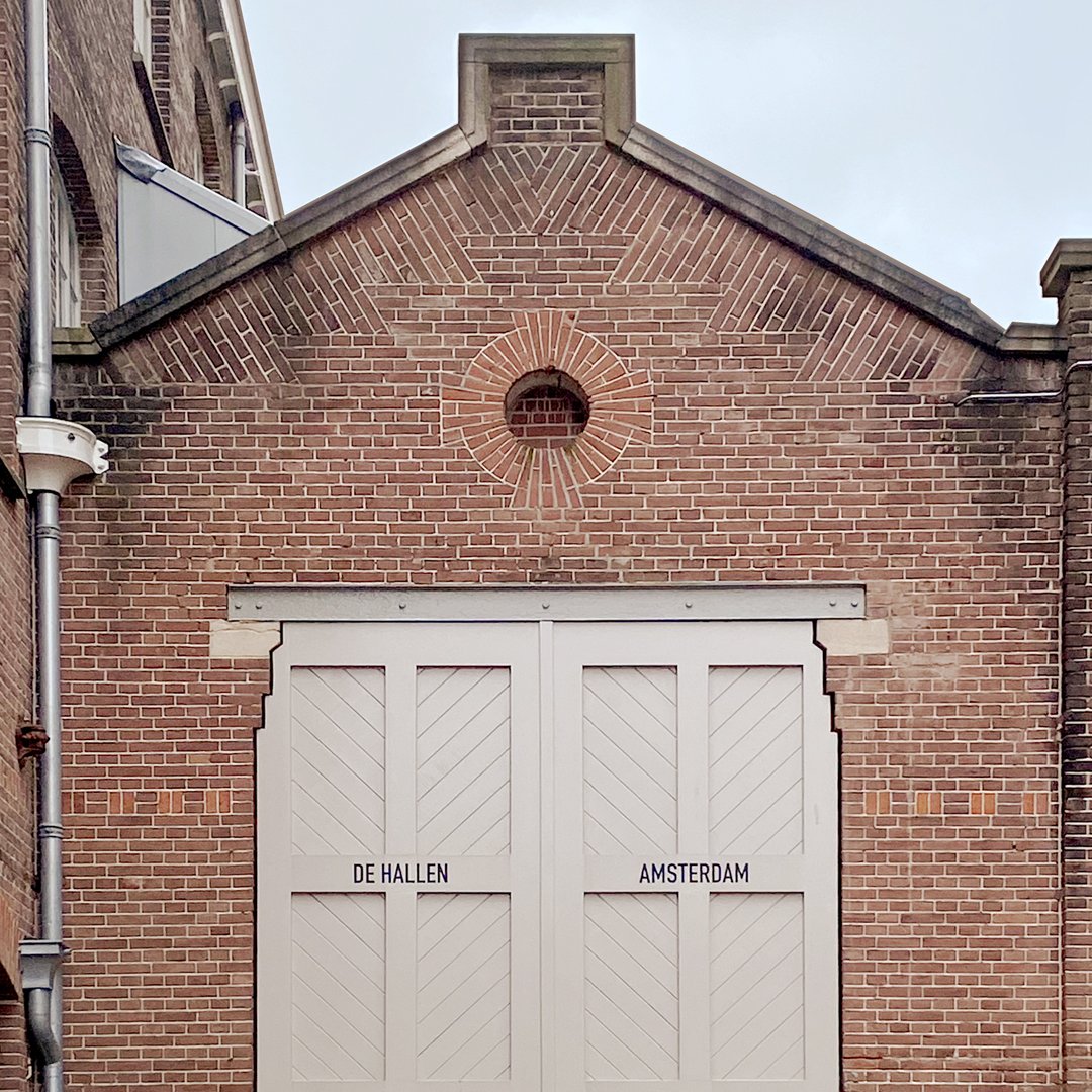
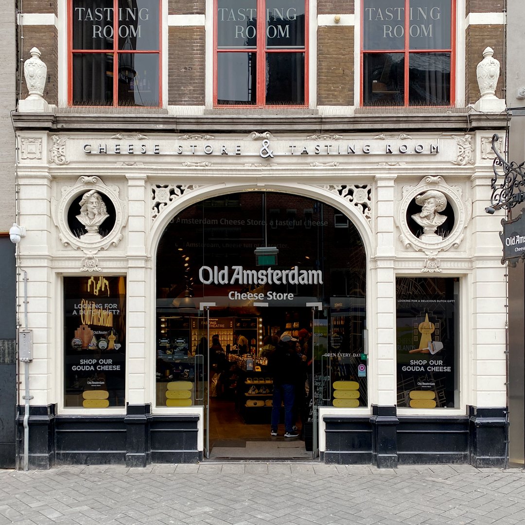
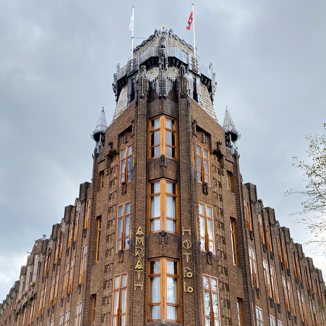
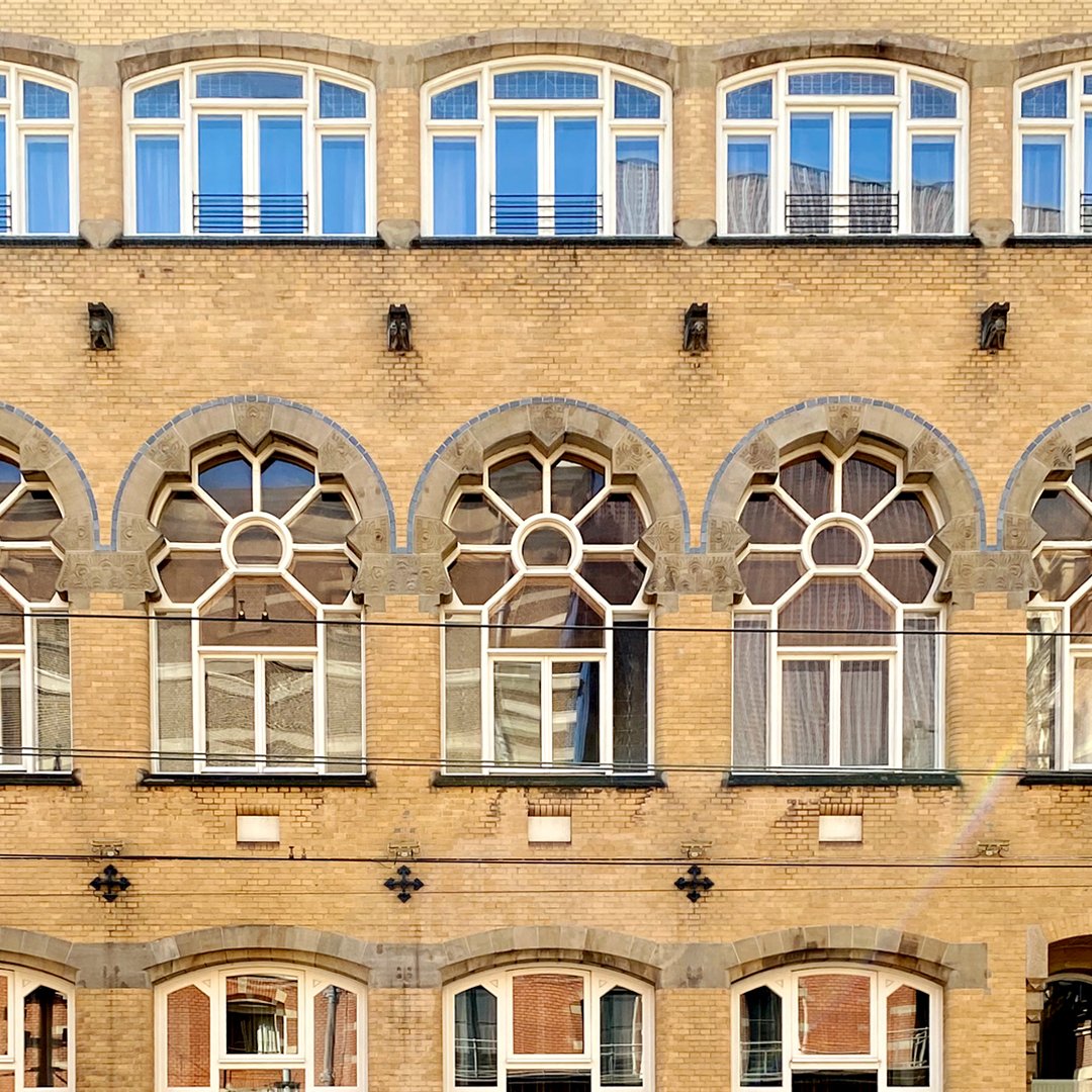
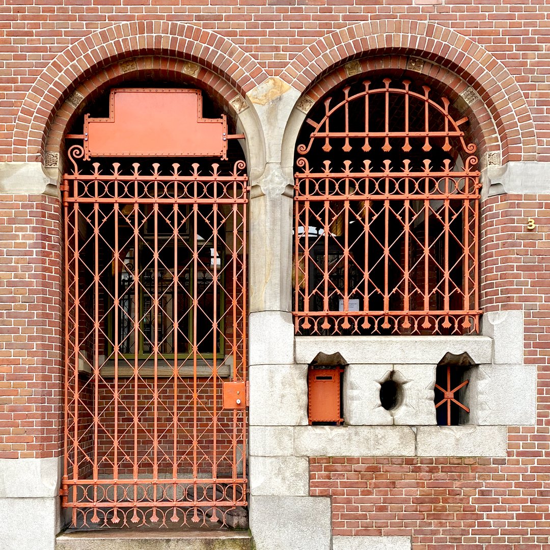
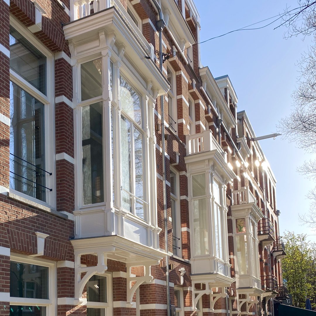
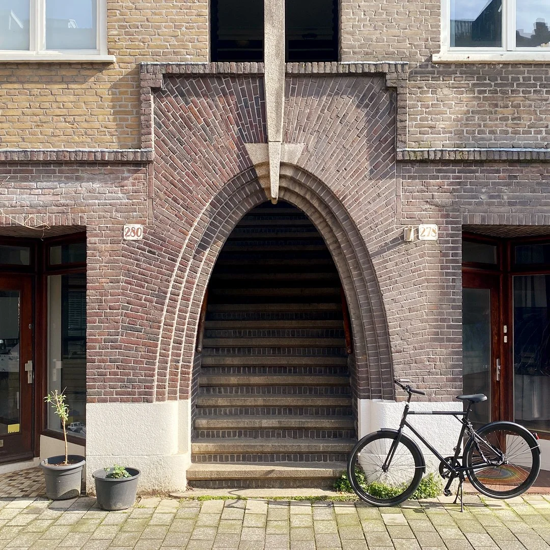
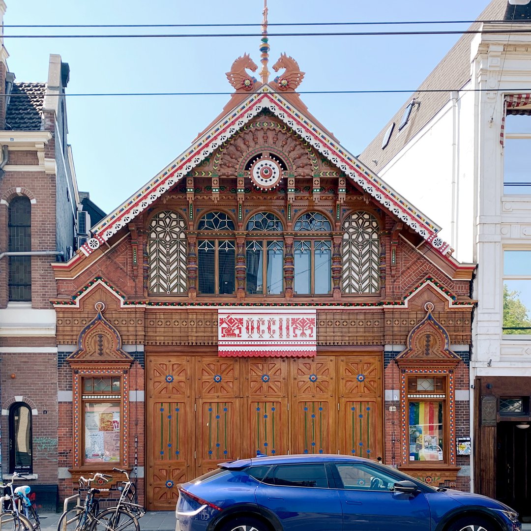
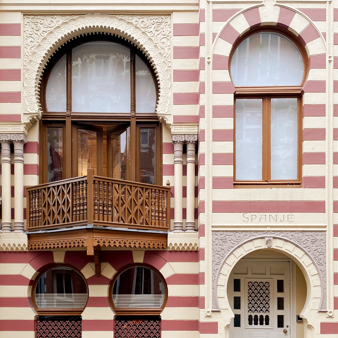
FACADE
AMSTERDAM ARCHITECTURE
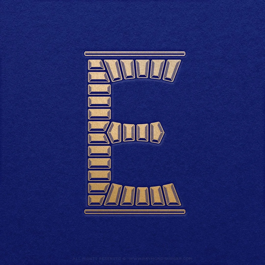
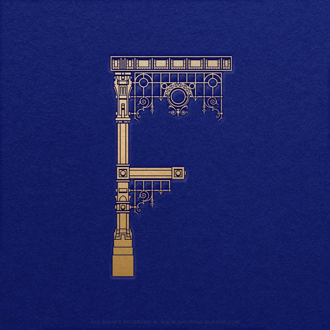
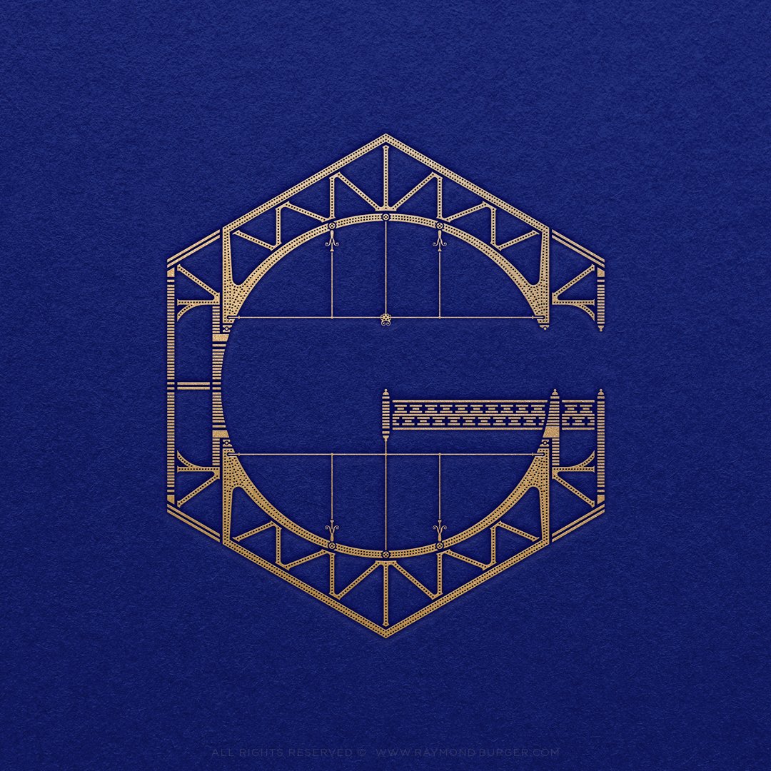
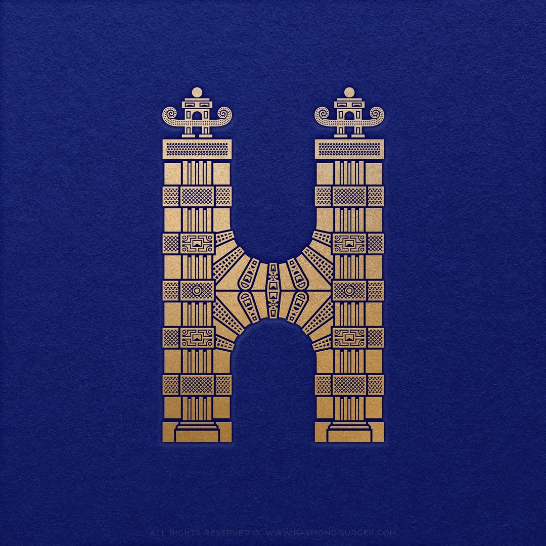
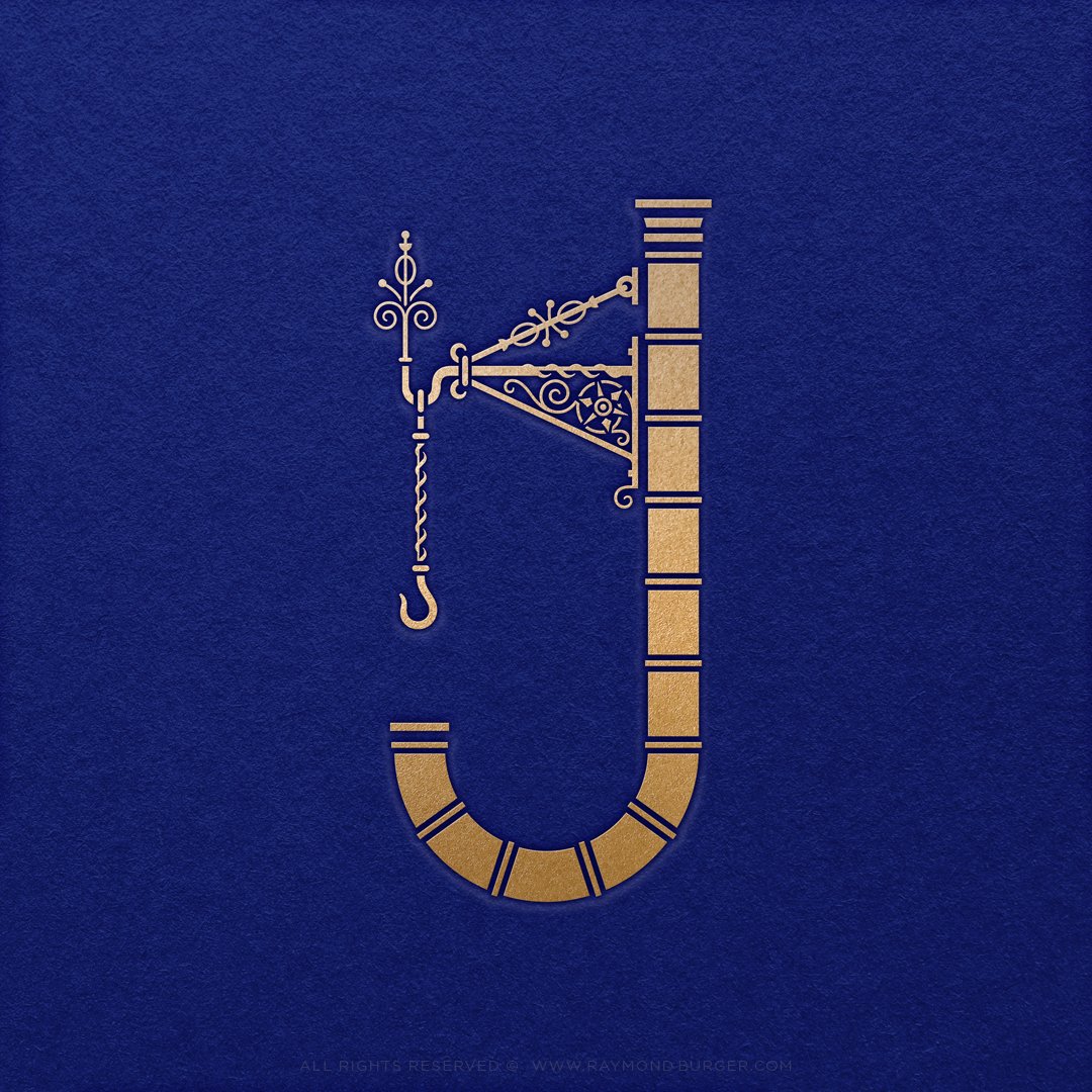
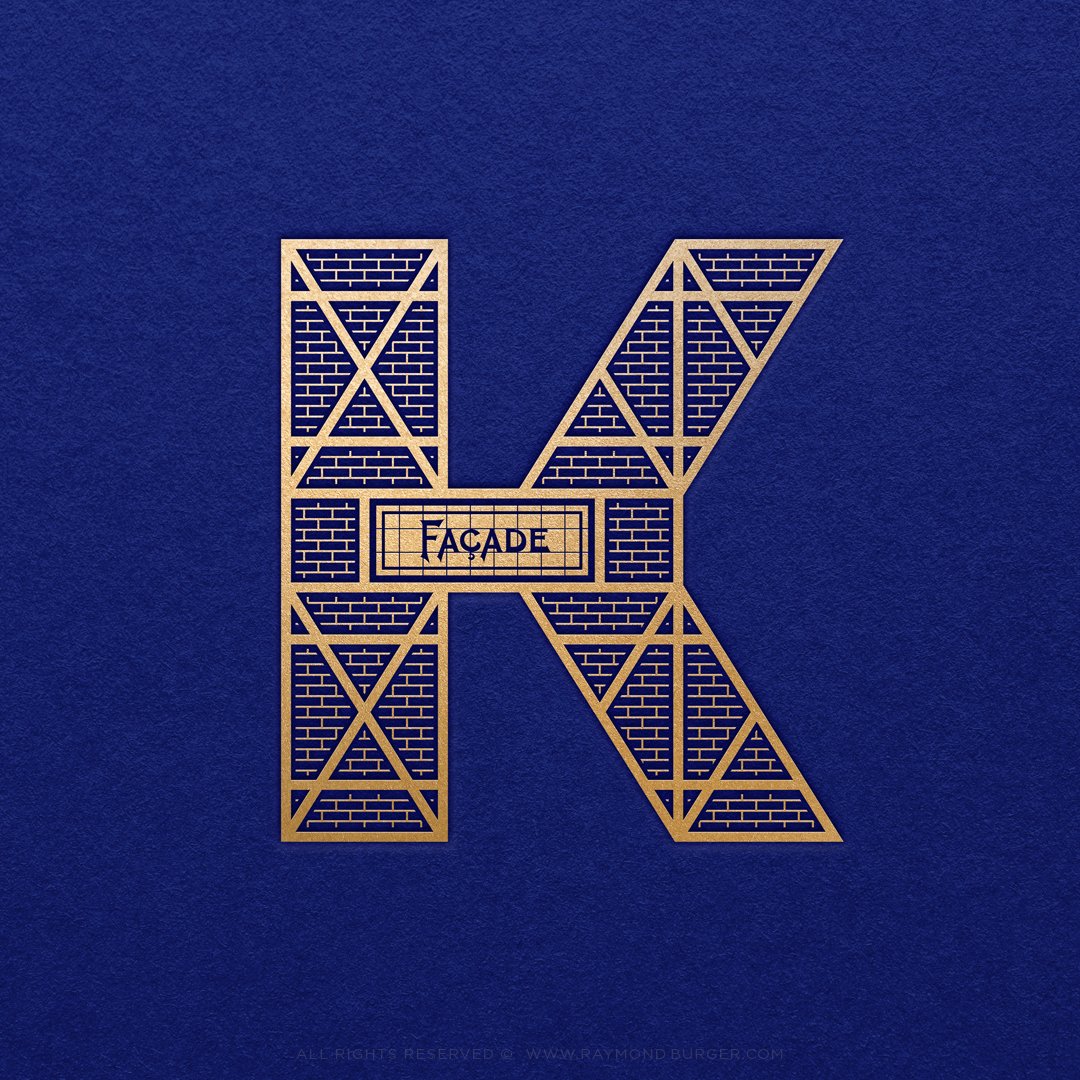
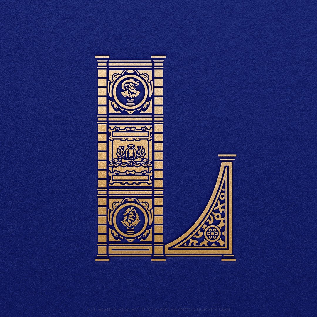
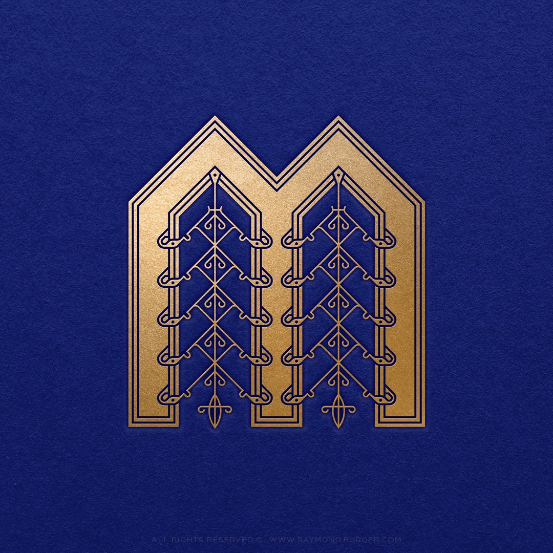
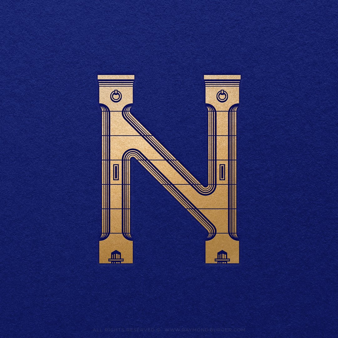
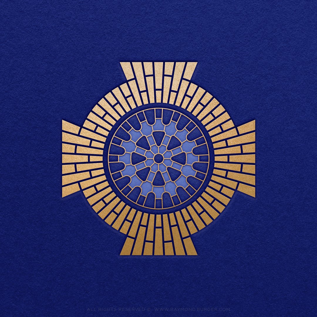
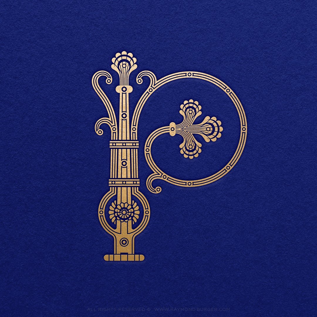
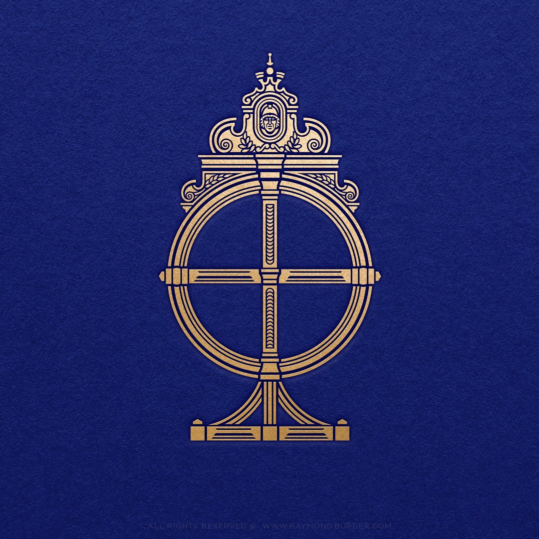
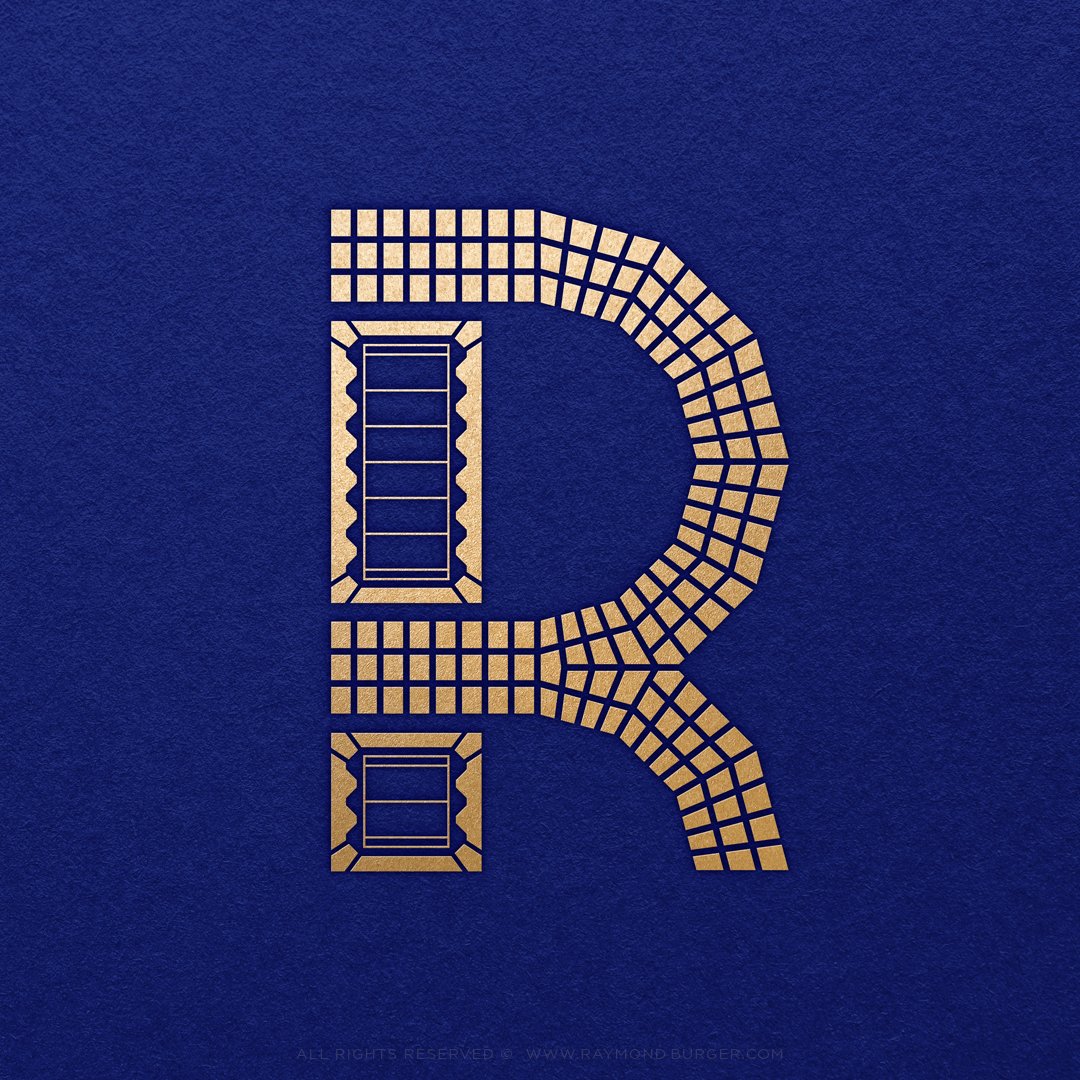
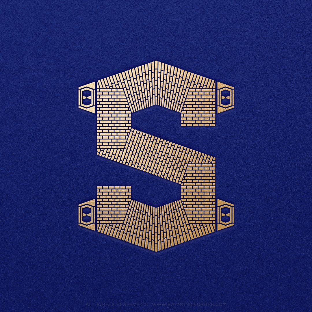
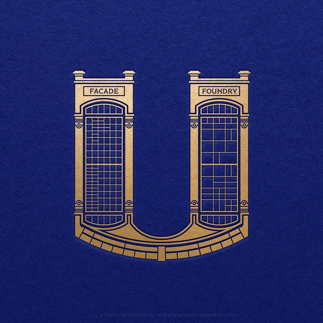
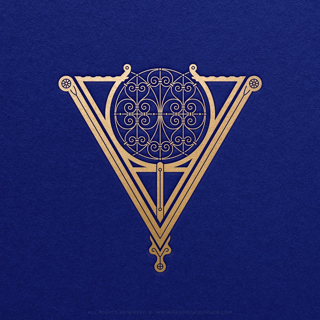
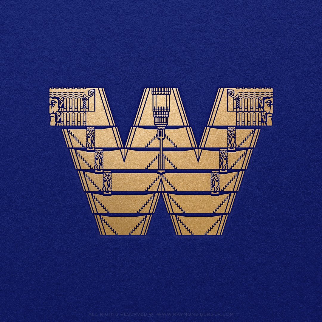
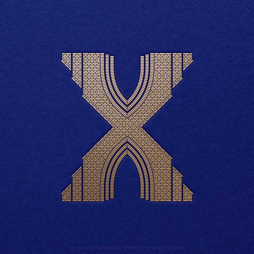
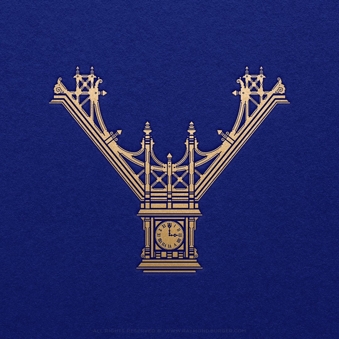
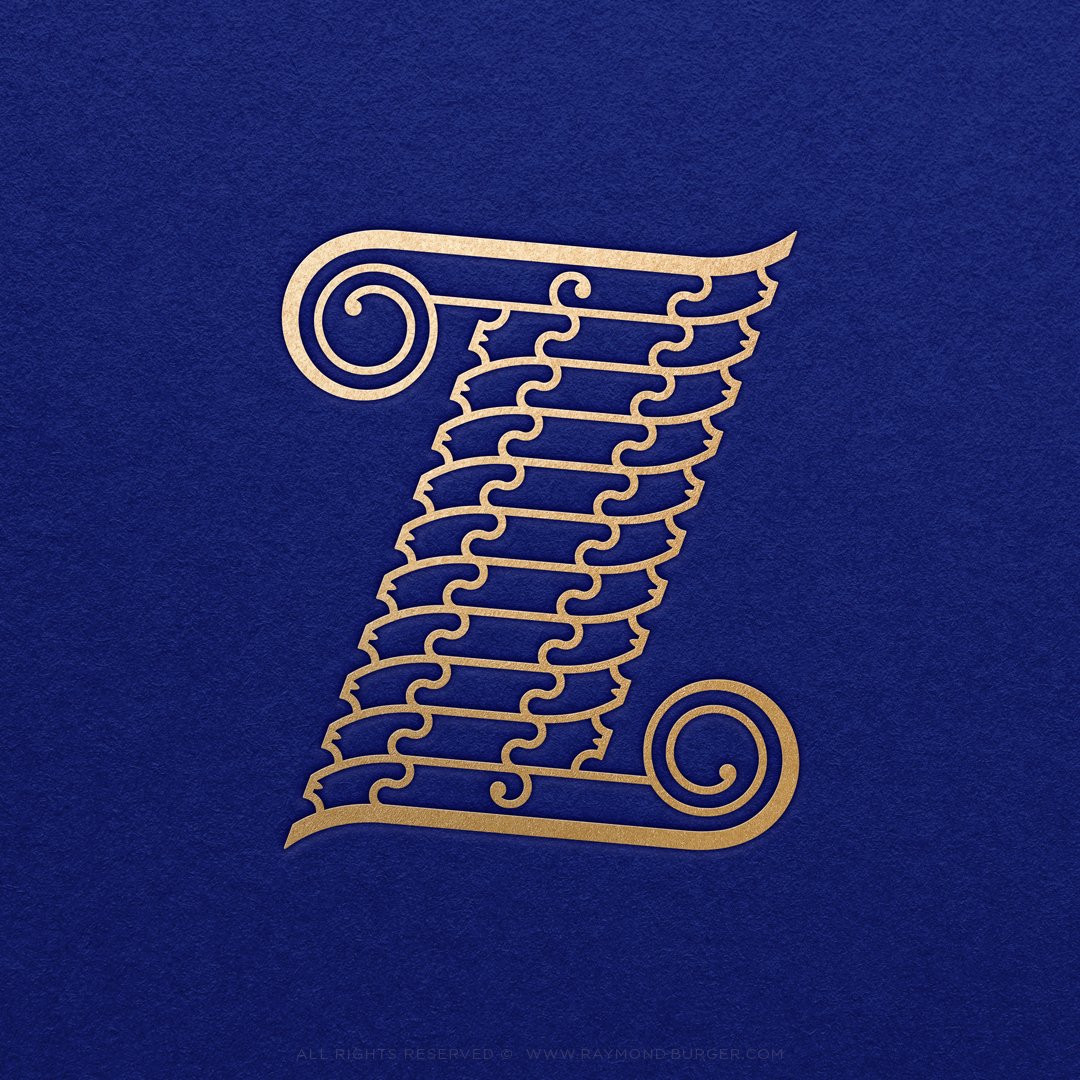
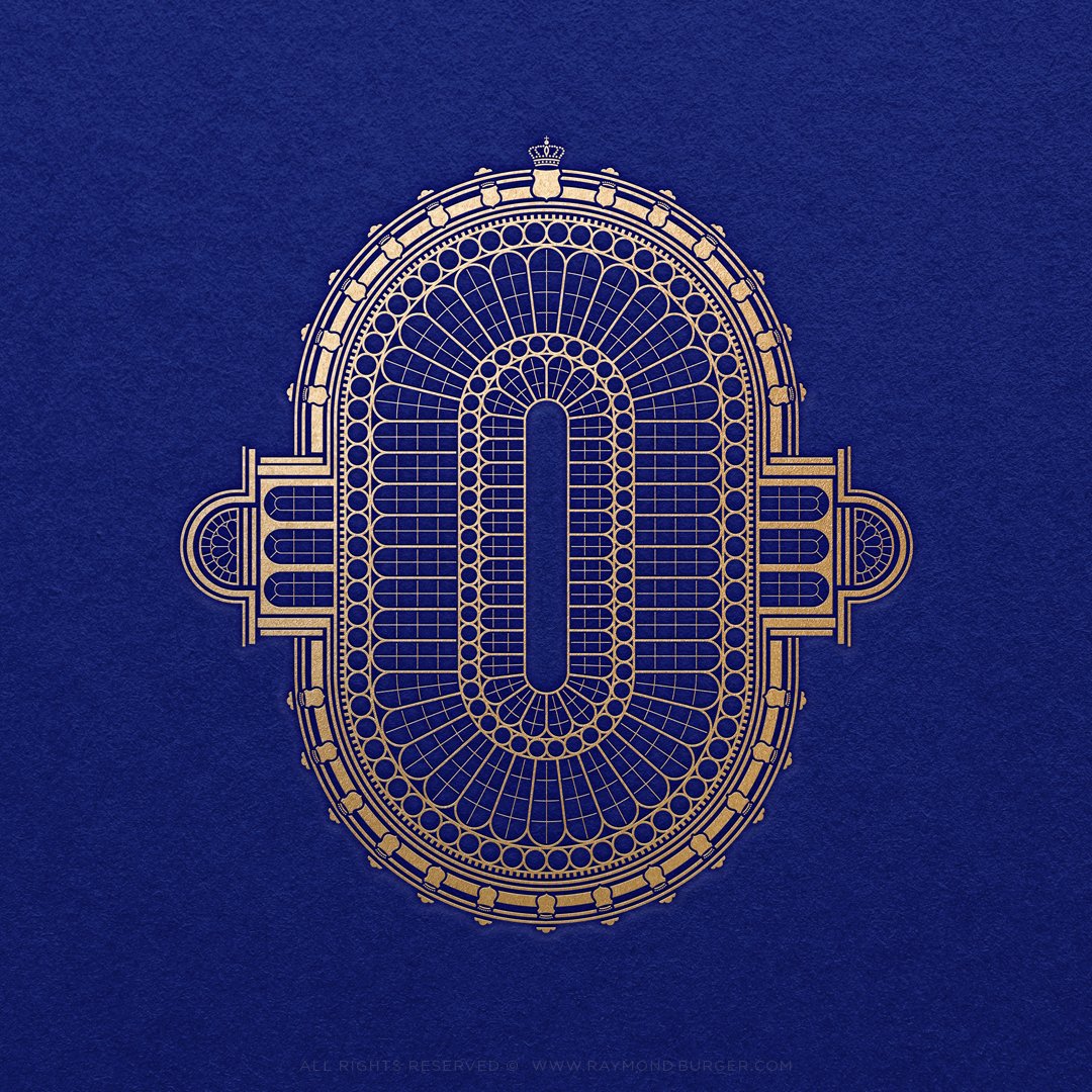
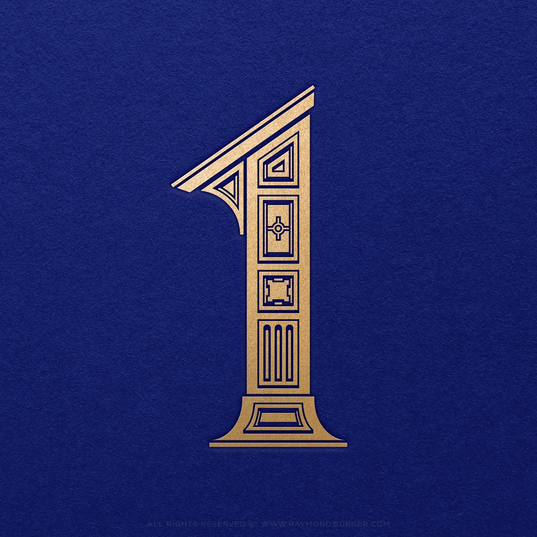
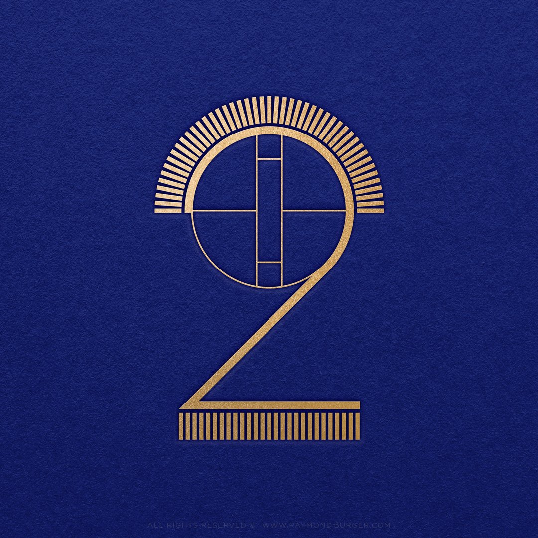
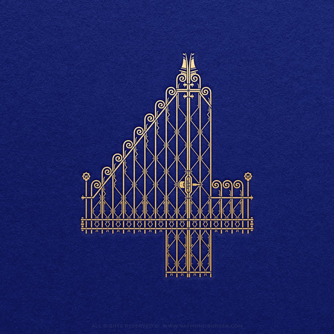
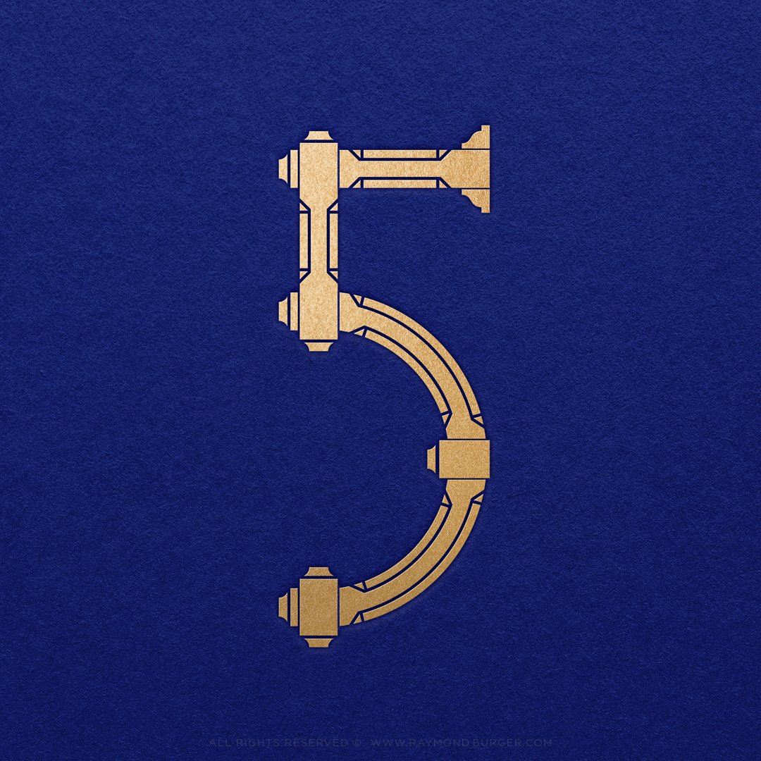
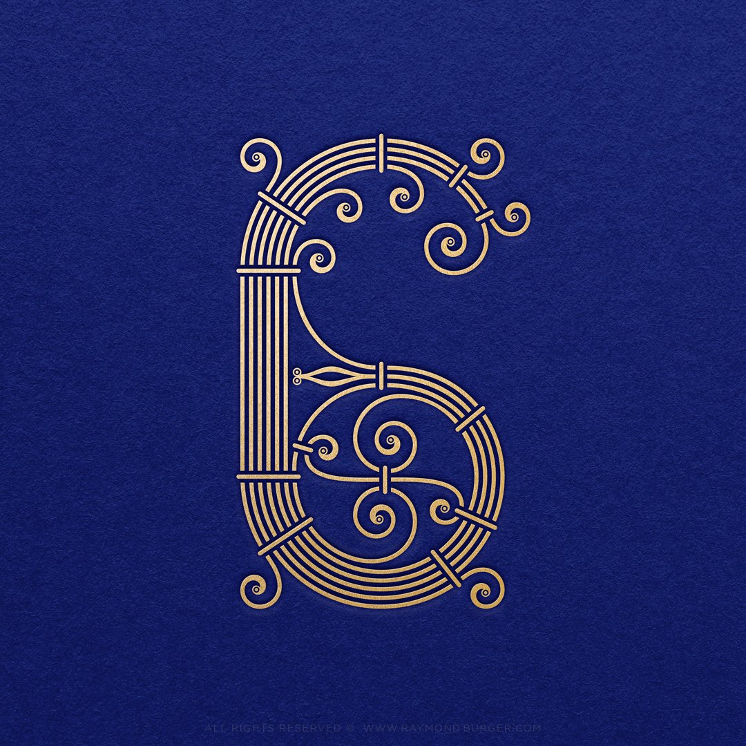
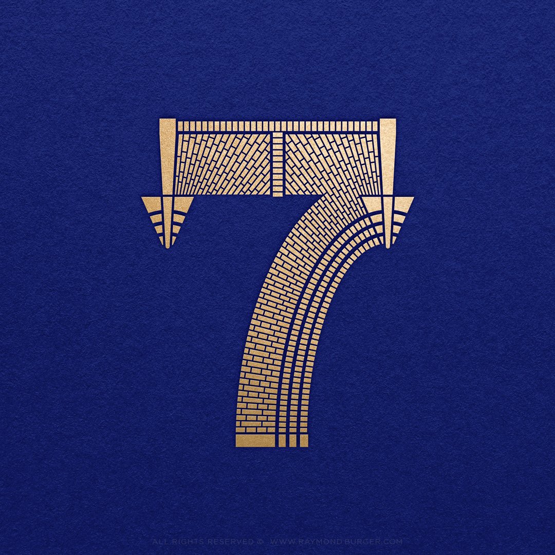
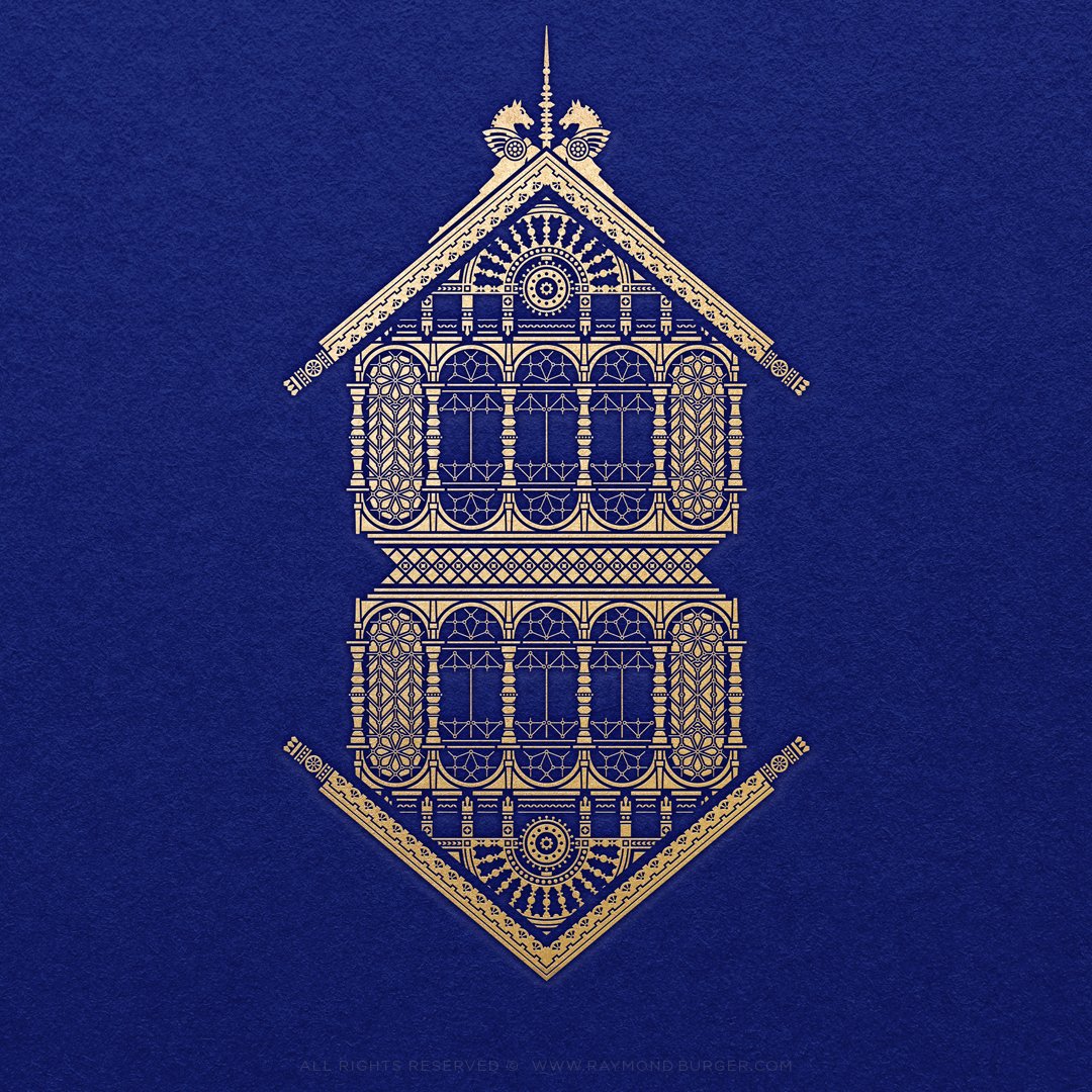
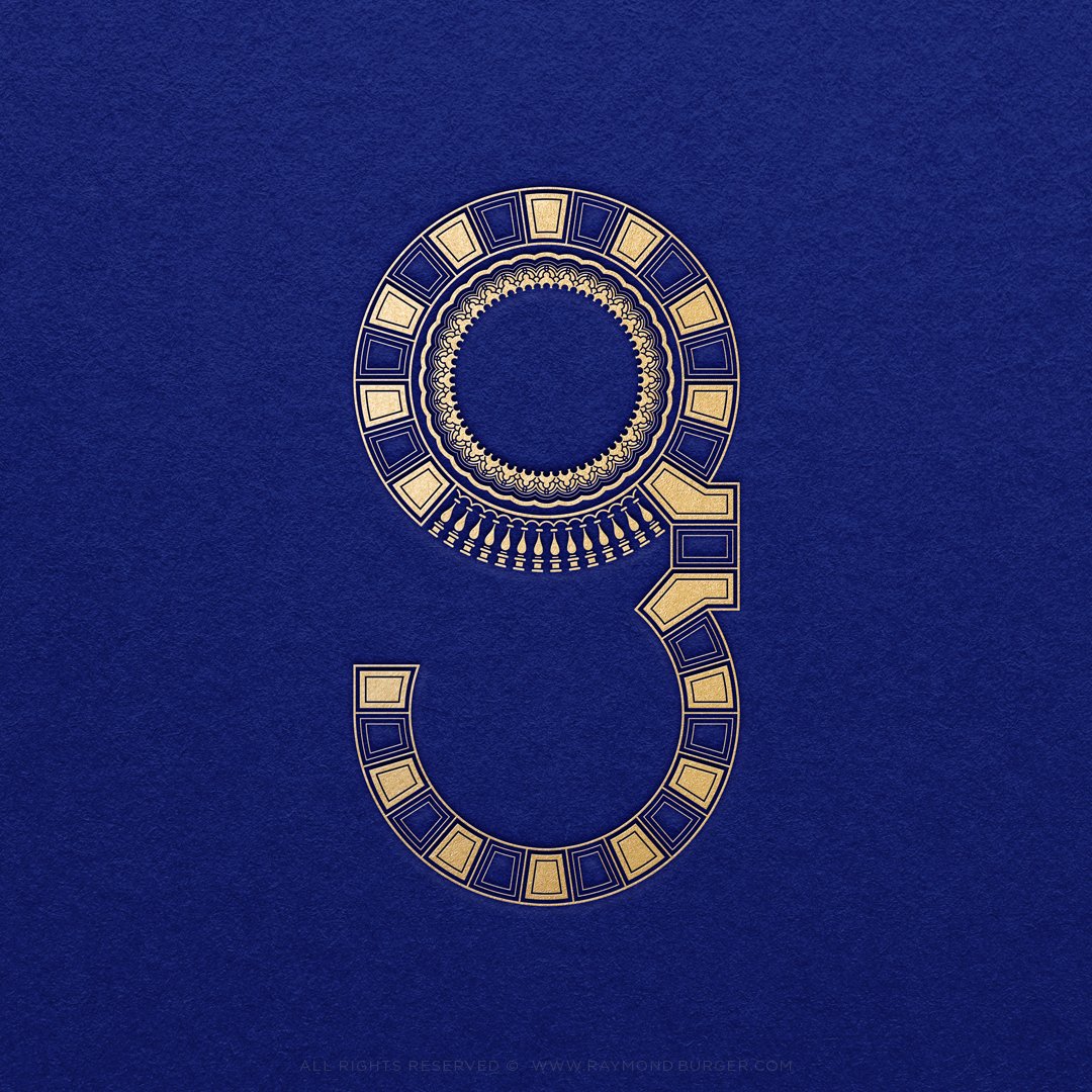
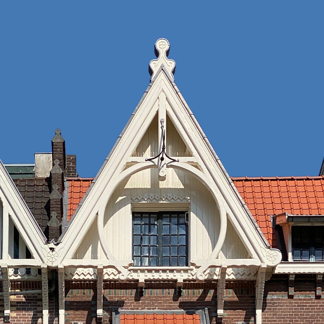
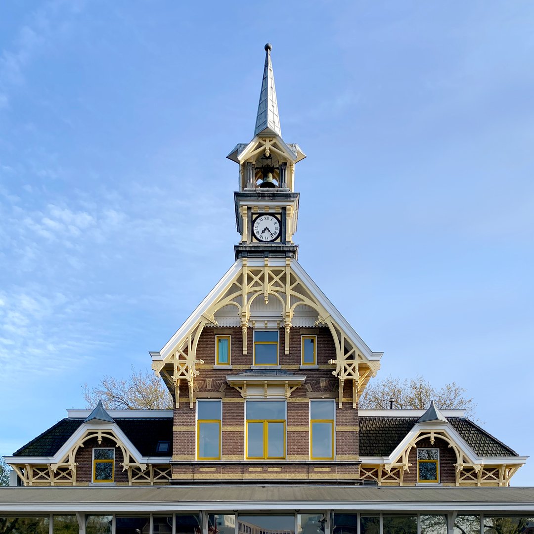
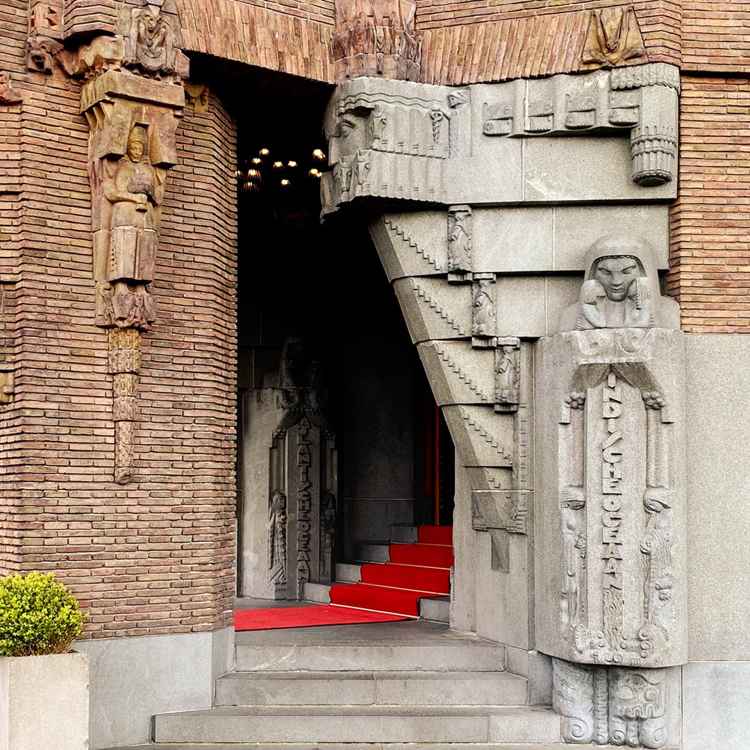
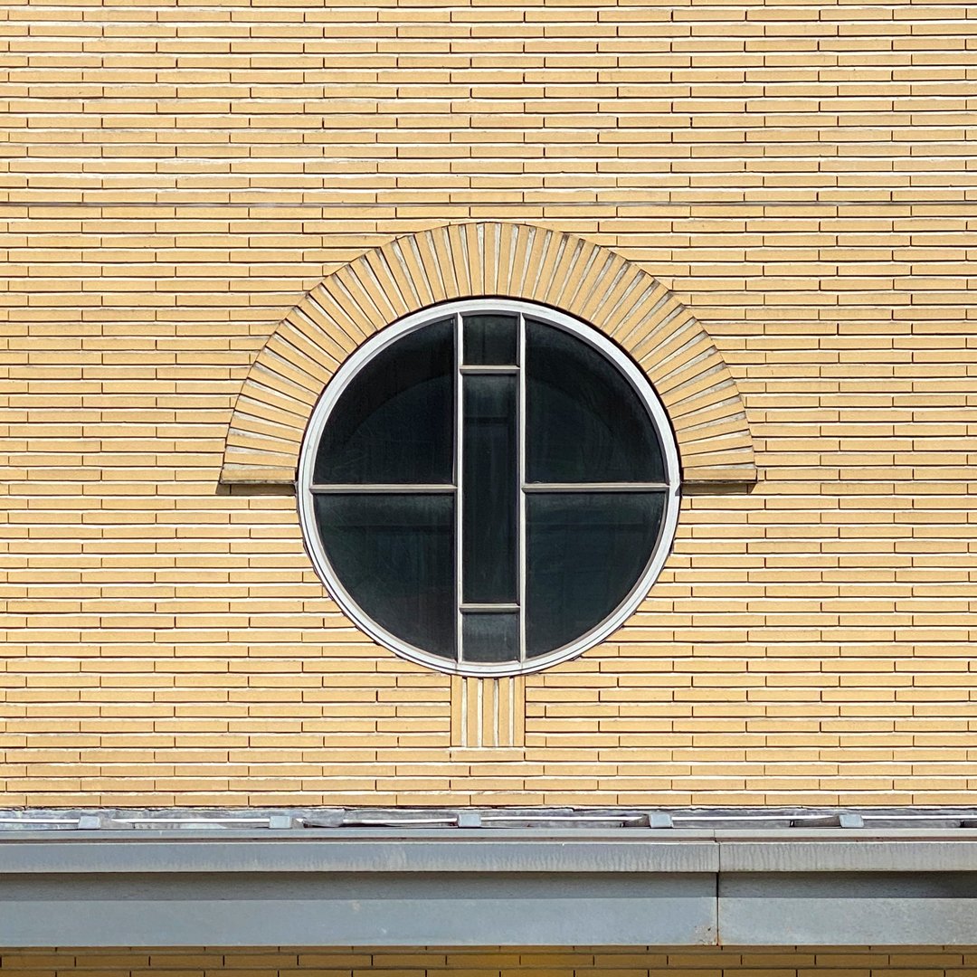
Fundamental Architecture Capitals, Amsterdam Decorative Exploration. Lettering project inspired by architecture in Amsterdam. Looking for new letter shapes in old buildings, digging through archives, researching architects and constructing characters. Participated in the 36daysoftype project. You can find all the posts and inspiration on my Instagram.


CONIMEX
INSPIRING INDONESIA
A humble brandicon for the new designs of Conimex. Quality Indonesian cuisine combined with the personal origin of the brand. The lady, with traditional way of dressing hair, is wearing a batik patterned sarong. A flowing brushstroke is shaping the sun on vibrant and recognizable packaging. Agency: SGK

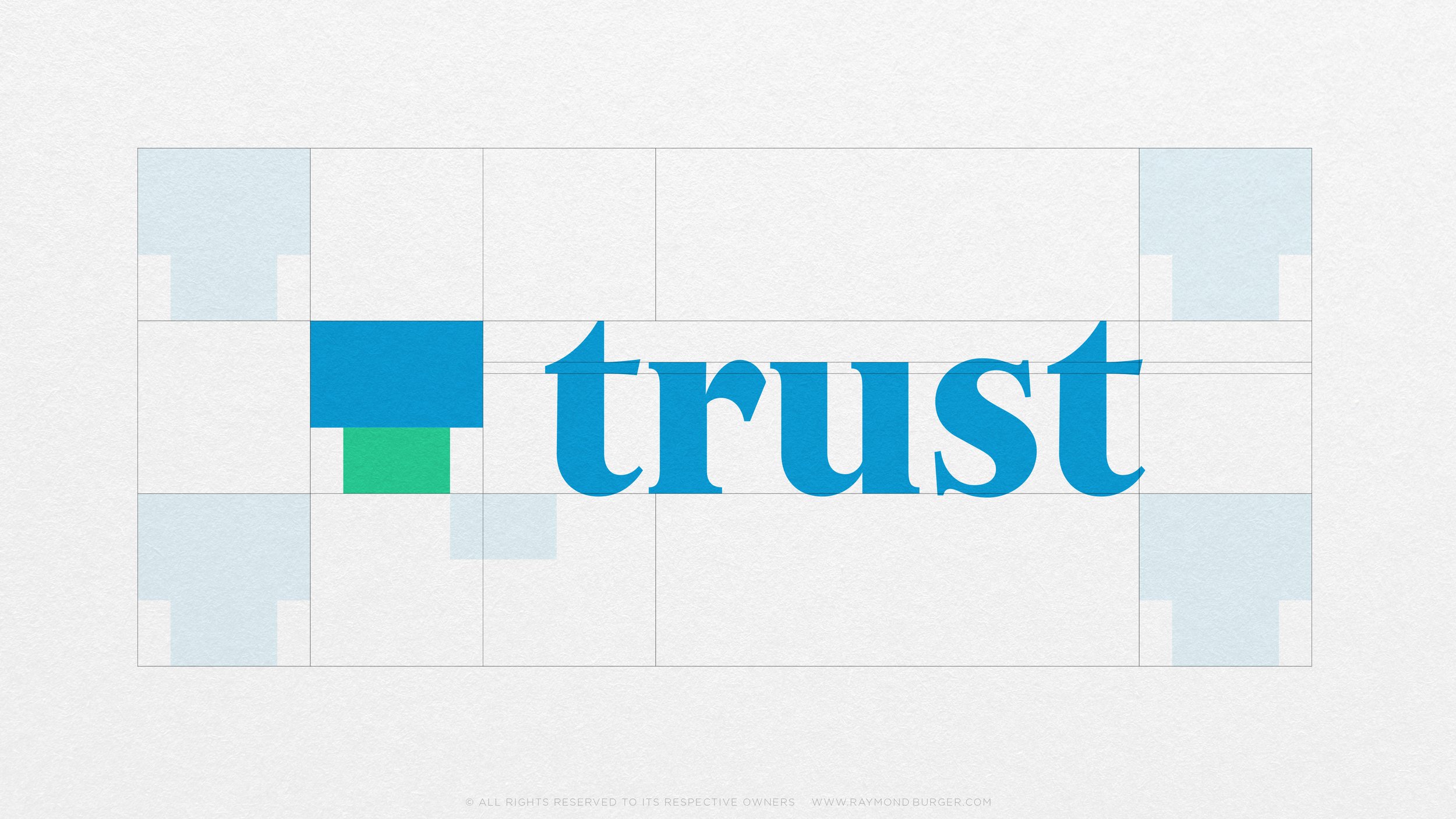
TRUST
THIS IS US
The new digital bank for Singapore. Superunion commissioned me to work on the letter refinement of the wordmark. Agency: Superunion

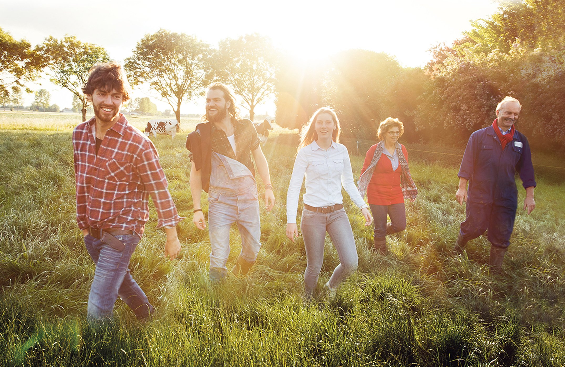
DEN EELDER
FAMILY FARM
The next generation of Den Eelder farmers launched a redesign of their entire dairy product line. Branding agency Vuurland asked me to create an engraving style illustrations; Of a realistic friendly cow in the field, a goat, typical local birds and recognizable elements for the existing consumers and at the same time to appeal to younger people. And portraits of the family of farmers in the same style.


SCHIPHOL
SHOP & DISCOVER
Bold Dutch orange and Royal Delft blue illustrations brightly shining above the stores; To emphasize the Netherlands in the Schiphol shopping experience. Shop category items emerging from the ‘Rising line’ branding element and the motifs are relating to the subject. Online category icons will help you to discover what Schiphol is offering. And gifts will be wrapped in a pattern made of seasonal items, bringing the experience of Schiphol all over the world into to your home. Agency: Millford


MYREPUBLIC
FAST & FRIENDLY
Asia-Pacific leading telecommunications provider MyRepublic is celebrating their 10-years anniversary with the launch of the new logo. Working closely together with Superunion Singapore and MyRepublic’s in-house brand team on the new brand identity refresh; Creating a crisp and iconic evolution of the rocket brand icon and a custom typeface. With a bit of a friendly and fun vibe fitting with the brand personality. Playful character illustrations by Ken Kaneko. Agency: Superunion
Transform Award 2021, Visual Property, Gold.


JUMBO
STRENGTH & FLAVOUR
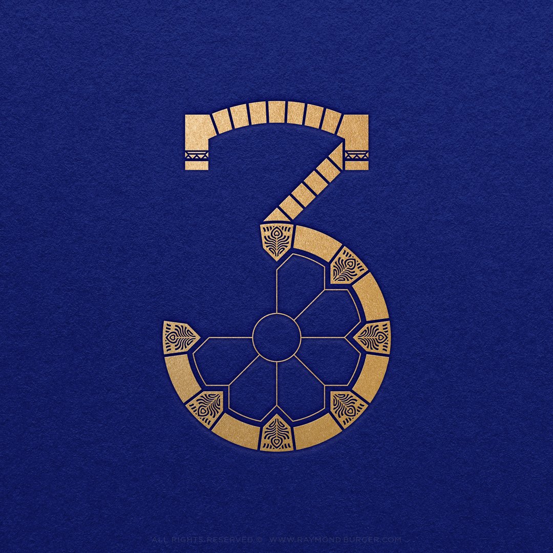
A stylish look for Jumbo private label coffee. The challenge was to develop an iconic set of letter designs which are the carrier of the espresso cup pack range. The numbers have a graphic pattern which corresponds with the flavour experience of the product. The strength of the coffee is shown with complexity of the pattern. And the flavour description inspired the colours and elements; For example 06 Impressa is rich and full, with an intense finish and aroma’s of toast and nuts. Agency: Guts&Glorious
The Vertex Awards 2020, Bronze.
BISOU BANDANAS
POSITIVE EMPOWERING
Logo design for a headwear company: Handmade turbans and bandanas to empower women going through their fight against cancer and to brighten lives with colourful headwear.
Portrait of the owner; Elegant & cheeky. Name development; Positive & full of love. Custom typeface design; Friendly & bold.
CANEI
FUN & FRIZZANTE
A new look for Canei, an elegant fresh sparkling grape blend. Originated in 1975 in Canelli, North Italy. I was commissioned to create a playful brandicon of an adventurous Mastiff on an Italian scooter. Inspired on the Mastiff dog of the crest of Canelli. Check 'La vita Frizzante' on www.canei.com
Agency: Vbat
Wine Design Awards 2018, Gold. Packaging Awards 2018, Gold.
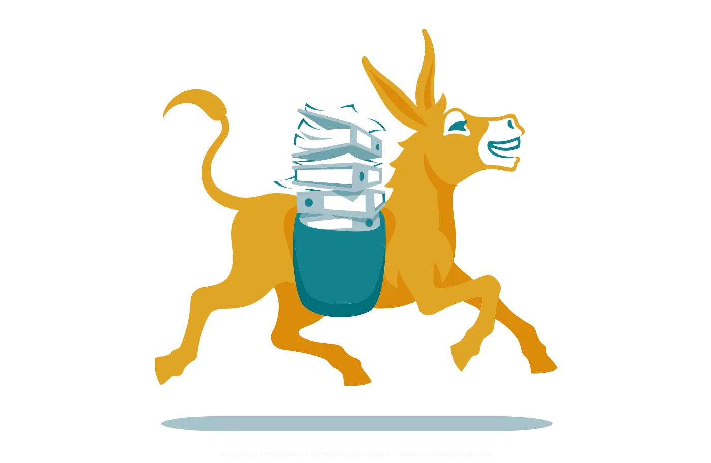
STAYWISE
SMART SERVICE
Staywise is a service provider for trade unions. OD designstudio created a full design rebranding with a friendly mascotte representing the enthusiastic Staywise team: versatile, helpful, a little stubborn and always wise! They commissioned me to design the final donkey brand icon, friendly donkey character illustrations for the brandbook and portrait illustrations of the Staywise team. To see the designs in use you can check: www.staywise.nl
Agency: OD designstudio


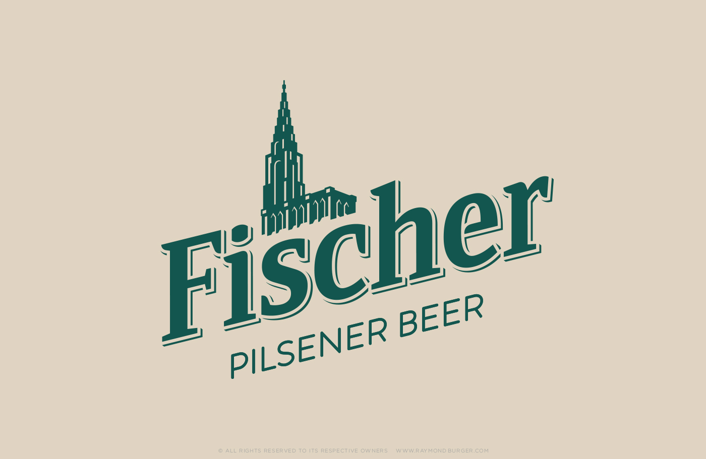
FISCHER BEER
gothic cathedral for greece
The brewery in Strasbourg was named after its founder Jean Fischer and the brandicon is the Cathédrale Notre-Dame de Strasbourg. The South-German Gothic style building with its 142m high Northern tower. The architect Ulrich Ensinger decided not to build a second tower on the south side. Which feels a bit weird but created the asymmetric and recognizable façade. I was asked to recreate a more up to date and readable brand icon of the cathedral. The packaging was created for the Greek market. Check out the website for the for more information in Greek: www.fischerbeer.gr
Agency: Vbat
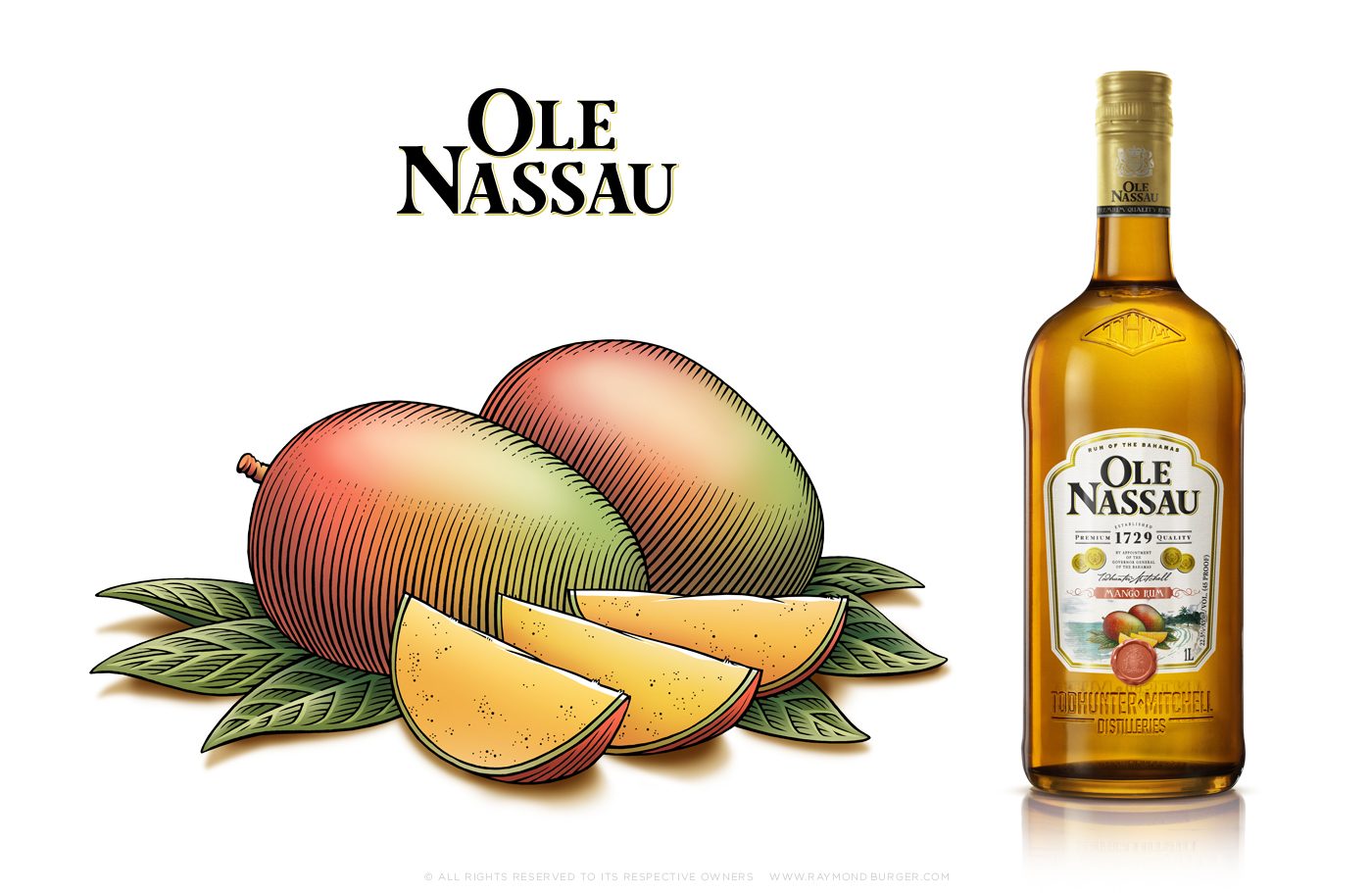
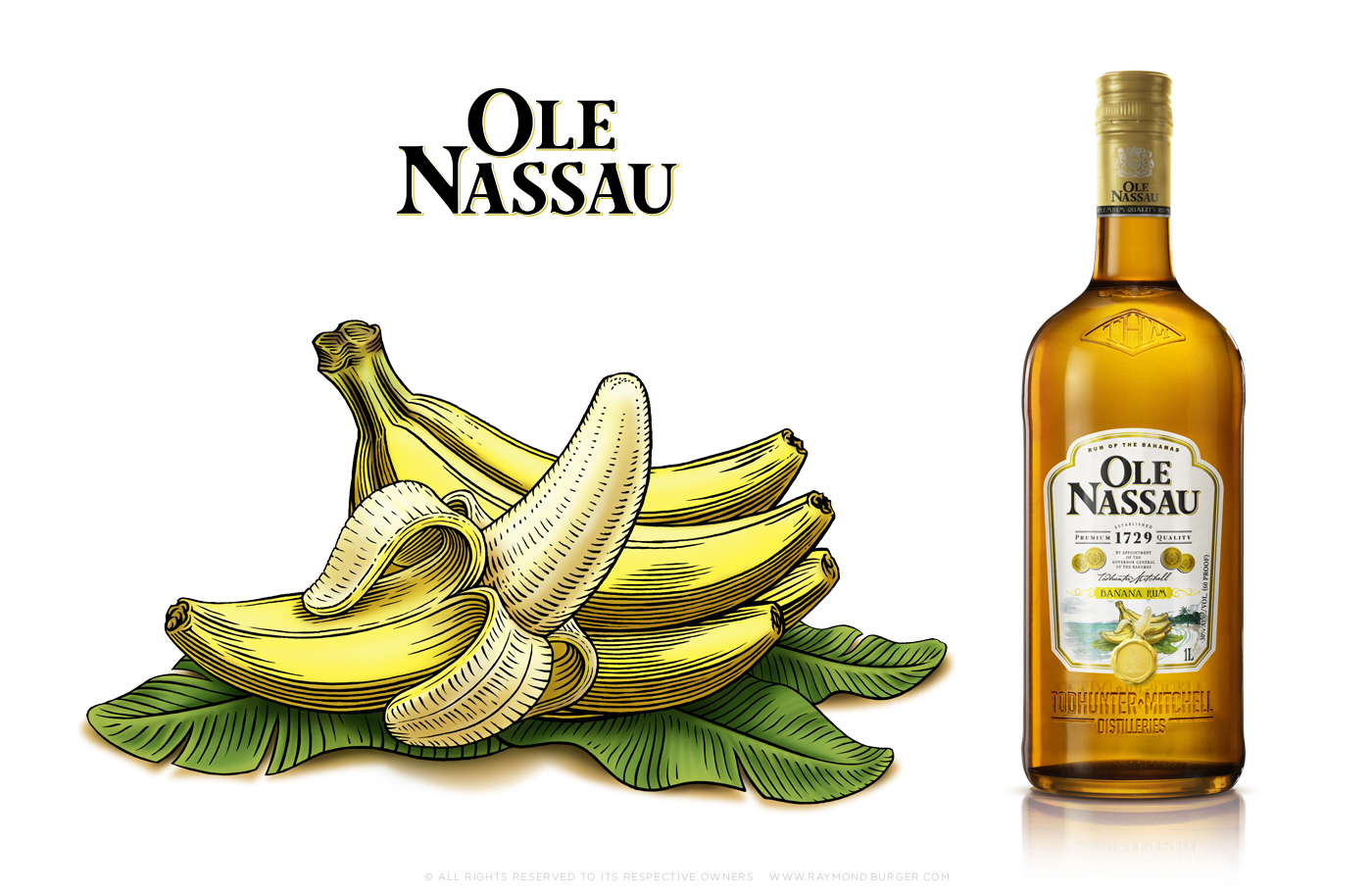
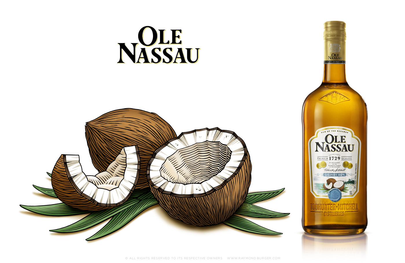
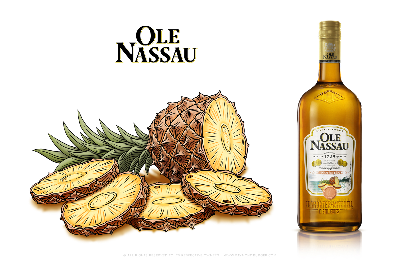
OLE NASSAU
FRUITY BAHAMAS
Ole Nassau is a special Bahamian rum for the more classic rum lover. For the fruit flavoured version of the rum I made illustrations of Mango, Banana, Coconut and Pineaple. Linedrawings to have the same feel of the old seamaps of the caribbean. But coloured in to have the freshness of the fruits.
Agency: Vbat
AMSTEL BEER
SYMBOL OF FRIENDSHIP
In September 2016 Amstel launched their new range of packaging, designed by the excellent beer design team of Vbat, and I had the honour of making the illustration. Amstel was founded in 1870 by Charles de Pesters and Johannes van Marwijk Kooy. Today it is the 6th largest international beer brand in the world. My illustration of the two founders in their younger years portrays their friendship and symbolizes friendship all over the world. For the story behind the beer you can check: www.amstel.nl
Agency: Vbat
NEDERLANDSE LOTERIJ
successful fusion
De Nederlandse Staatsloterij & De Lotto have merged and are continuing with the name: Nederlandse Loterij. For this new corporate brand Millford Brand Identity commissioned me to work on the new brandicon; Also a fusion of the two logo's De Nederlandse Staatsloterij white fish on orange background and the red and blue arches of De Lotto. If you want to read more about Nederlandse Loterij you can check: www.nederlandseloterij.nl
Agency: Millford

STRONGBOW APPLE CIDERS
clear and fresh illustrations
During summer 2015 Strongbow, the worlds leading apple cider brand, launched four new cider flavours: Gold Apple, Red Berries, Honey and Elderflower. I designed four new iconic illustrations that are fresh, attractive and fitting the Strongbow-feel and existing logo. For the campaign check www.strongbow.com
Agency: Vbat
SWINCKELS' BEER
FAMILY CREST AS MODERN BRAND ICON
The 7th generation of the Swinckels family, owners of the Bavaria brewery, developed this luxury beer without preservatives. They were so proud of this unique beer they gave it their own name. I redesigned the original family crest into a modern and illustrative brand icon and a simplified version that is used as embossing on the bottle and glass. For a taste of this brand world check www.swinckels.com.
Agency: Design Bridge
Awards: Diamond Pentaward, Best of Show
SONNEMA BERENBURG
QUALITY MARK
FOR SPIRIT BRAND
I’m proud to have designed the illustration for this primeval Dutch spirit drink Sonnema Berenburg. The drink dates back to 1860. The spirit needed a graphic and sharp quality mark; Clear, readable and in proportion to the other elements on the new bottle. The brand icon, at the center of the bottle, is an illustration of its creator; The Frisian innkeeper Fedde Sonnema. Check www.sonnema.nl for the full Sonnema story.
Agency: Design Bridge.
Honors: Nomination Dutch Design Awards 2006
BRAND ICONS
ONE ICONIC IMAGE FOR YOUR BRAND
There is nothing more exciting to me than translating a essence of a product or company into an icon. I have done so for both star brands and agencies. After the briefing and research of the product history and brand story I create illustrations focusing on the future goals of the brand. I’m often called in for the imaginative feel and the revolutionary design route. Do you have a beautiful product and does your brand need a restyle or a new brand icon? Get in touch to explore how we can bring your brand to live with a custom brand icon.


LOGOTYPES
LET PEOPLE CONNECT WITH YOUR COMPANY
A logotype will express the character of the brand and connect with the emotions of the viewer. Here you see a selection of custom logotypes designed for corporate identities and all kinds of companies. What would you like your brand to express; subtle or loud, elegant or tough, funky or sophisticated? Or all of the above. Get in touch to explore how we can express and expand your brand world.


FUNX RADIO
RADIO SHOW PICTOGRAMS
Dutch public radio station FunX has local city stations in Amsterdam, Den Hague, Utrecht and Rotterdam; Playing all kinds of music styles focusing on the broad variety of people in the cities. Every radio show has a different style, concept and its own pictogram. I designed over 30 pictograms with the same FunX feel.
Agency: Netwerk
NIKE LIGHTWEIGHT
GRAPHIC SOLUTIONS
Nike excels at producing high end, technical and comfortable sports clothing. Their lightweight theme was all about getting fit. I translated this theme into a visual concept; The girls training in a light and contemporary space with an Olympic feel. Through the solution of a leporello (zigzag) booklet clients are able to read through it like a book, but also display it as an overview. I was in charge of the art direction, graphic design and final digital imaging. For the previous collection we created a booklet with a yoga theme.
Production: Eitlin. Photography: Arjaan Hamel and Jonathan Andrew.
NIKE STORE AMSTERDAM
RETAIL BRAND GRAPHICS
Nike has a new shop-in-shop in the premium department store De Bijenkorf in Amsterdam. Nike is all about moving fast and being athletic. I designed energetic graphics for the floor and fixtures. Inspired by existing Nike foot sole designs I created graphic patterns to attract customers into the store and drawing attention to the goods.
Agency: Multiple Identities.


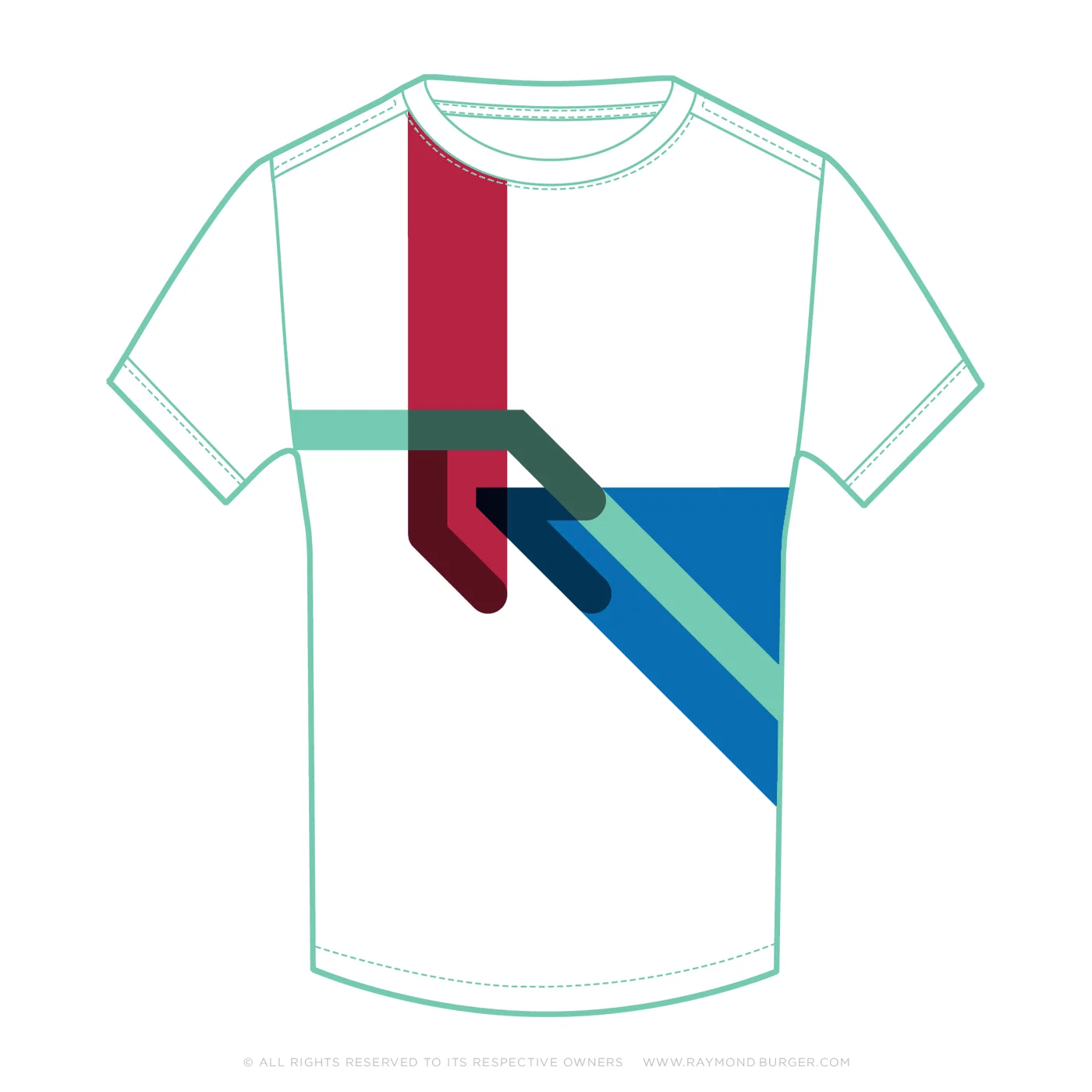
ROBEY SPORTSWEAR
diversity & unity
Sports bring out the competitive nature in all of us, but also supportive comradeship. I love to work for sports brands and to translate the energy of the game into strong design. For Robey I designed artworks in a fresh colour scheme for a trendy collection of casual T-shirts. I’m very excited about this project because I’ve created a diverse range of elements; And by maintaining the unity, the artworks together subsequently create a brand world. Discover the Robey brand at www.robeysportswear.com
Agency: Premium Inc.


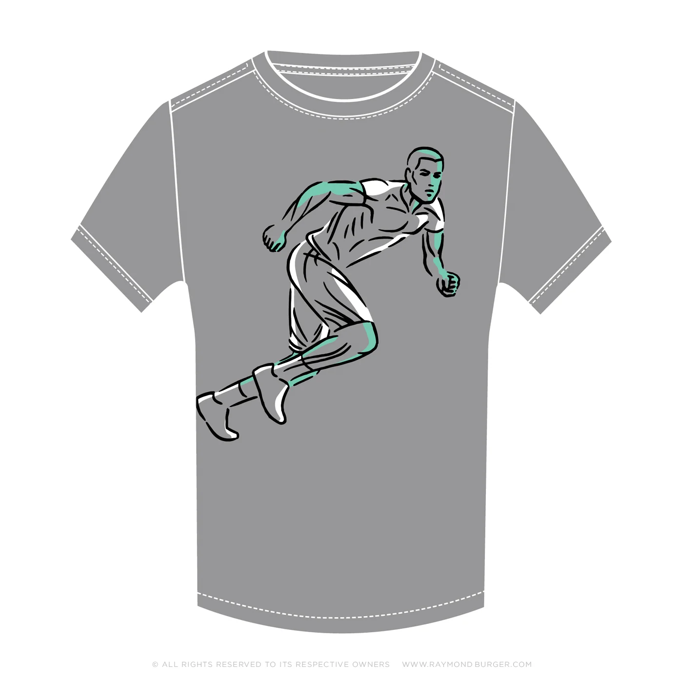
CRUYFF CLASSICS
FOOTBALL LUXURY
Johan Cruyff; One of the best football players in the world and a visionary trainer. His iconic status obviously formed my main source of inspiration for my designs. The lifestyle brand Cruyff Classics needed a casual T-shirt collection, for which I created portrait illustrations in several techniques and also I used my own constructures photography in one of the graphics. Learn more about the Johan Cruyff foundation and the clothing at www.cruyffclassics.com
Agency: Premium Inc.


CONSTRUCTURES
BEAUTY IS ALL AROUND US
Next to my own constructed illustrations I'm also intrigued and inspired by existing beauty. In this photographic search I'm looking for esthetic images in existing constructions, shapes and textures. This beauty can be found in anything; randomly evolved patterns in rock formations, the way the light hits the paper, or graphic effects in fabrics. These kind of images are not just interesting artistically but also useable for some of my design projects, Like in the 14-T-shirt for Cruyff Classics and the Nike Lightweight Collection book.


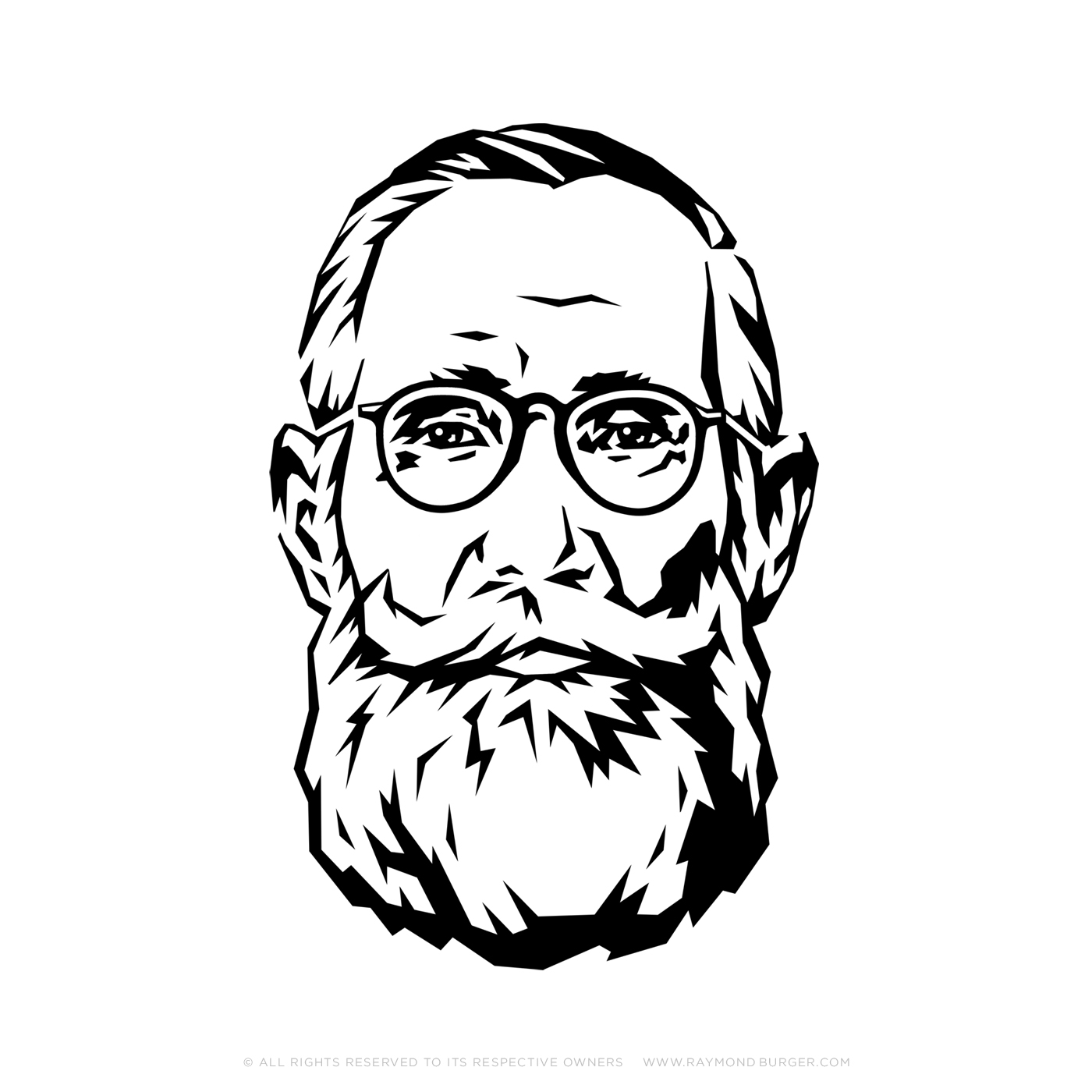
PORTRAITS
CAPTURING CHARACTERS
I make portraits for private, commercial and editorial use. I look for a style and technique that best reflects the character of the person I’m portraying. Would you like an original gift for your loved one?
A personalized portrait is unique art piece. Do you want to stand out on LinkedIn and other social media? Have a creative company profile picture; Send me a message.


THANKS FOR YOUR VISIT!
This was a selection of my work to show you a variety of design elements I can create in the style and technique best suited for the project.
I hope you've enjoyed my work. If you want to see more check out my instagram account.
ABOUT
Raymond Burger is a freelance illustrator specialized in illustration for branding and design. Since 2002 he has been working with international design studio’s and advertising agencies on projects for great brands; Crafting of powerful brand icons, custom logotypes and illustrations. His designs vary from graphic symbols to detailed decorative artworks. The style and technique of the designs are created for the specific purpose per project. Working closely together with the design team or directly with the client.
CLIENTS
I've had the honor to work with great agencies on projects for high end brands. Here is a selection of clients and brands.
DBOD, Brand New Design, Tribal DDB, VBAT, Nike, Design Bridge Nederland, Branddoctors, JKR, Philips Design, Caracta, Premium Inc, Netwerk, Unity Design, OY.communications, Ernstige Zaken, Philips, Begin Studio, Design Bridge Limited, Janusian Schwitters, Millford, Meijer & Walters, Yellow Dress Retail, Design Bridge Asia, Discovery Channel, Multiple Identities.
BRANDS

CONTACT
ASK RAY
If you have a question, a remark or a great idea feel free to email me or fill in the form.
Phone
+31 625 200 700
Address
Agatha Dekenstraat 47-3
1053 AN Amsterdam
The Netherlands
Company information
IBAN: NL 38 ING B000 1158874
KVK: 37108673